
BRAND STRATEGY & DESIGN LEADERSHIPRebuilding the Foundations of Foleon
What started as “let’s refresh the brand a bit” quickly turned into one of the biggest and most ambitious projects I’ve worked on. It quickly became clear we were dealing with something much bigger. What followed was a large-scale effort to rethink how the brand works across every corner of the business — from strategic foundations and visual systems to campaigns, templates, web experiences, and internal adoption. In other words: less “new coat of paint,” more “renovating the entire house while people were still living in it.
The challenge
The existing identity no longer reflected the maturity of the company, the product, or the ambition of the brand.
Different teams were solving the same problems in different ways. The visual language lacked consistency across touchpoints, the system was difficult to scale, and the brand experience felt fragmented depending on where customers interacted with Foleon.
The challenge wasn’t simply redesigning assets. It was creating a cohesive system flexible enough to support a fast-growing company across marketing, product, campaigns, events, and future expansion.
The process
Discover & Diagnose
Audited every existing brand asset across all teams to map inconsistencies and understand why the system was failing. Benchmarked competitors, gathered stakeholder input, and built the brief that would ground every decision that followed.
Define the Direction
Ran a creative direction sprint to develop and pressure-test three distinct routes. Presented concepts to leadership, facilitated the decision, and secured full C-suite sign-off before a single asset was made.
Create the System
Turned the approved direction into a complete, scalable brand system: guidelines, Figma library, templates, verbal identity, marketing assets, and a website redesign in collaboration with external agency Norday.
Deliver & Embed
Rolled out the full system with internal training, governance documentation, and onboarding across GTM, Product, PS, and Marketing — establishing feedback loops to keep the brand consistent as the company scales.
STRATEGIC DIRECTION“We are the Architects. Our platform is the foundation for our clients to build truly impactful content. We give them the foundation, the walls, the structure — and together we build something beautiful.”
From blueprint to every room in the house
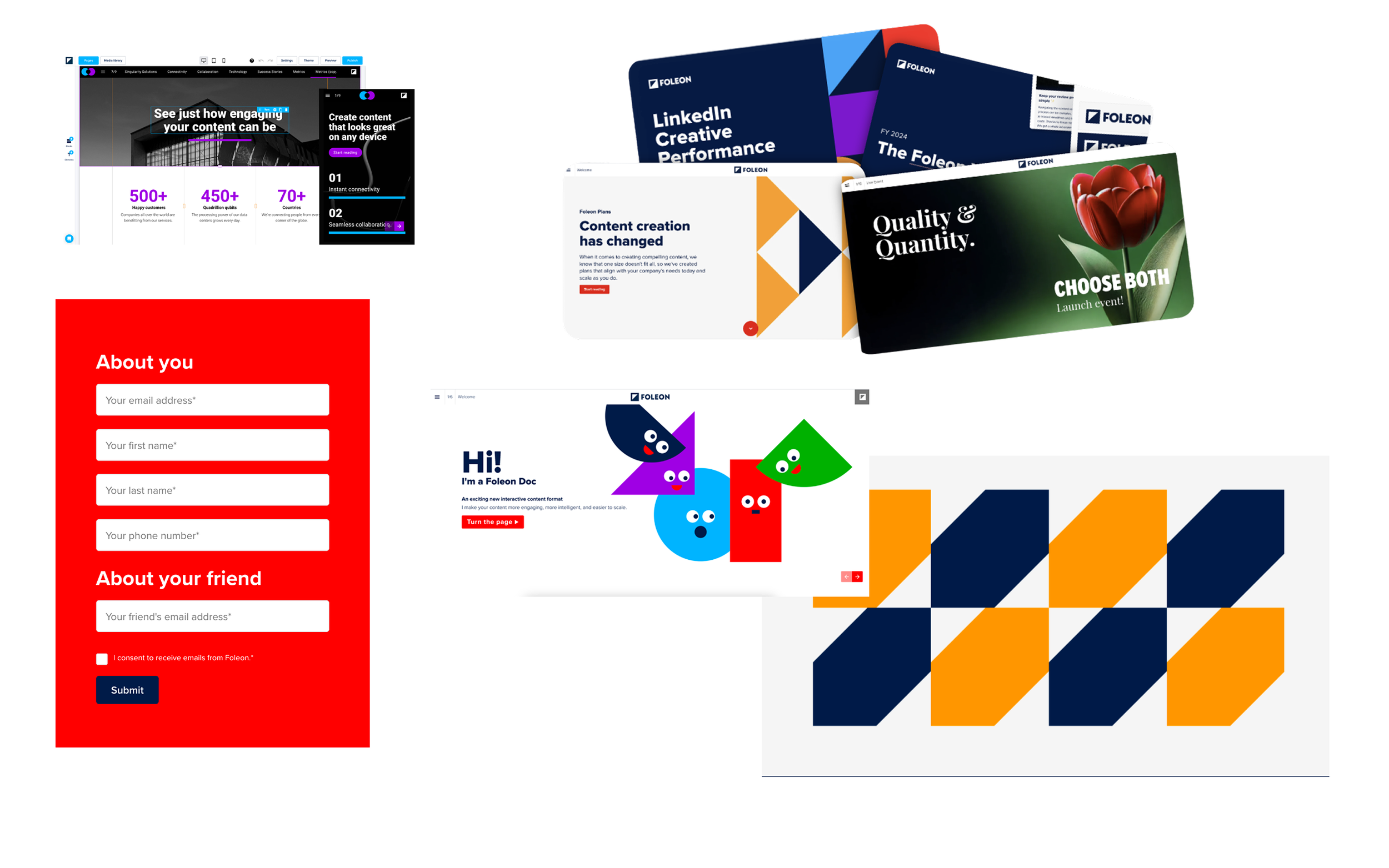
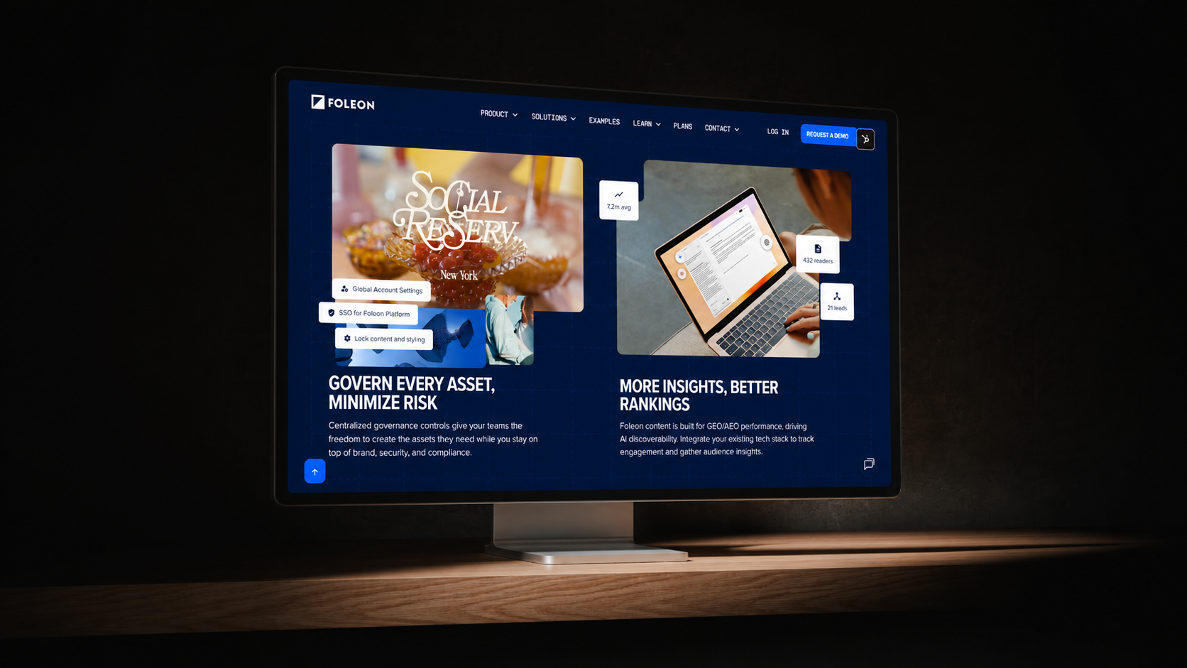
Website
The website was the most visible proof point of the new brand — and the one with the highest stakes. I led the collaboration with Norday, the external agency brought in 6 pages for the redesign, briefing them on the Architect direction and ensuring every page reflected the new visual language.
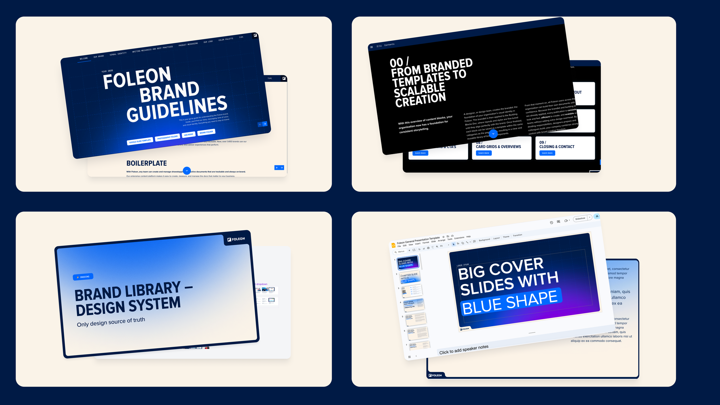
Foleon Docs
Foleon Docs are both our product and our proof — every doc we send is a live demonstration of what the platform can do. I redesigned the full template library inside the Brand Console, building modular blocks that any team could pick up and use. Governance was built in from the start: Brand Kits, Global Modules, and role-based permissions ensured that as teams scaled their content output, the brand stayed intact.
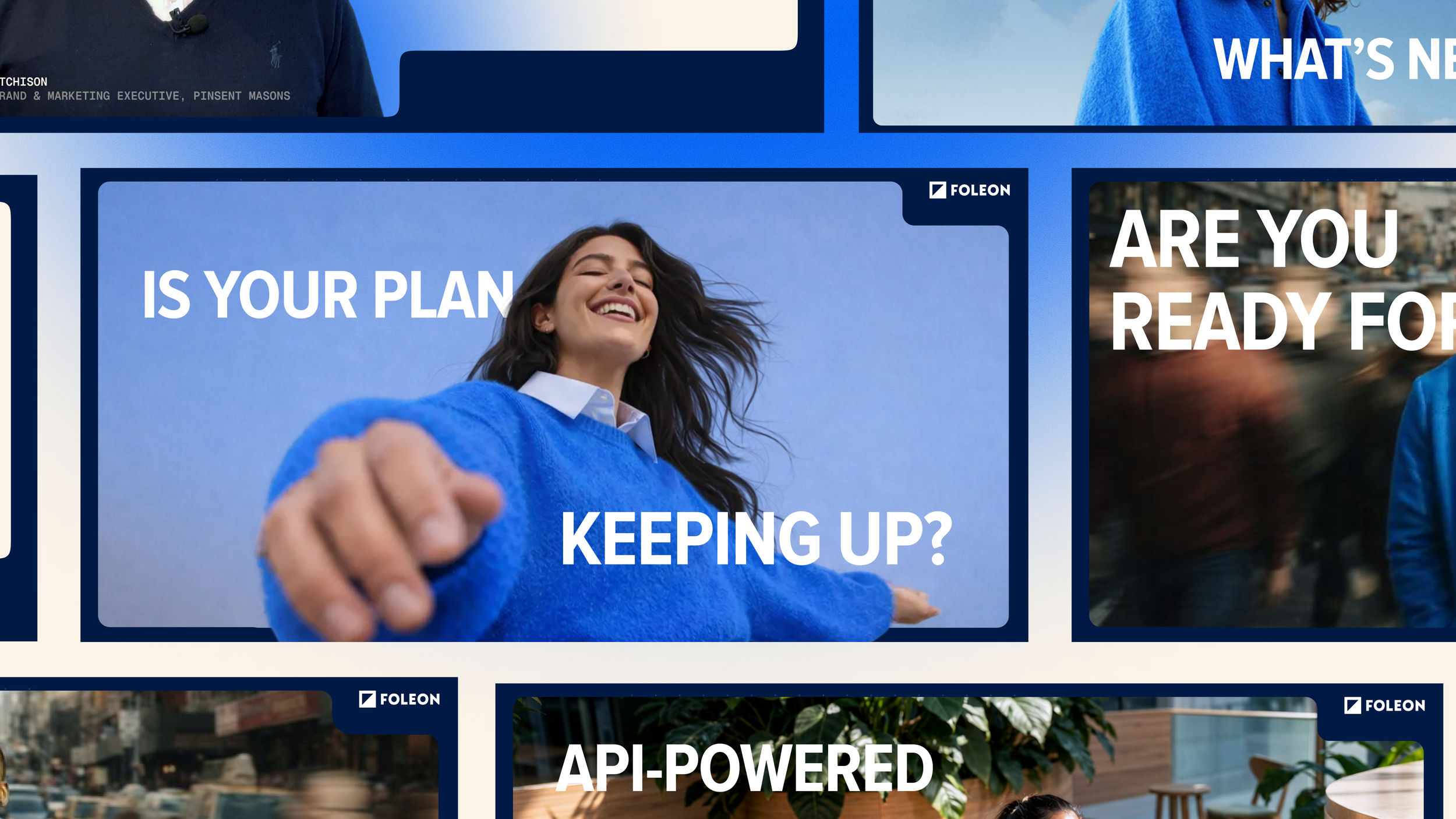
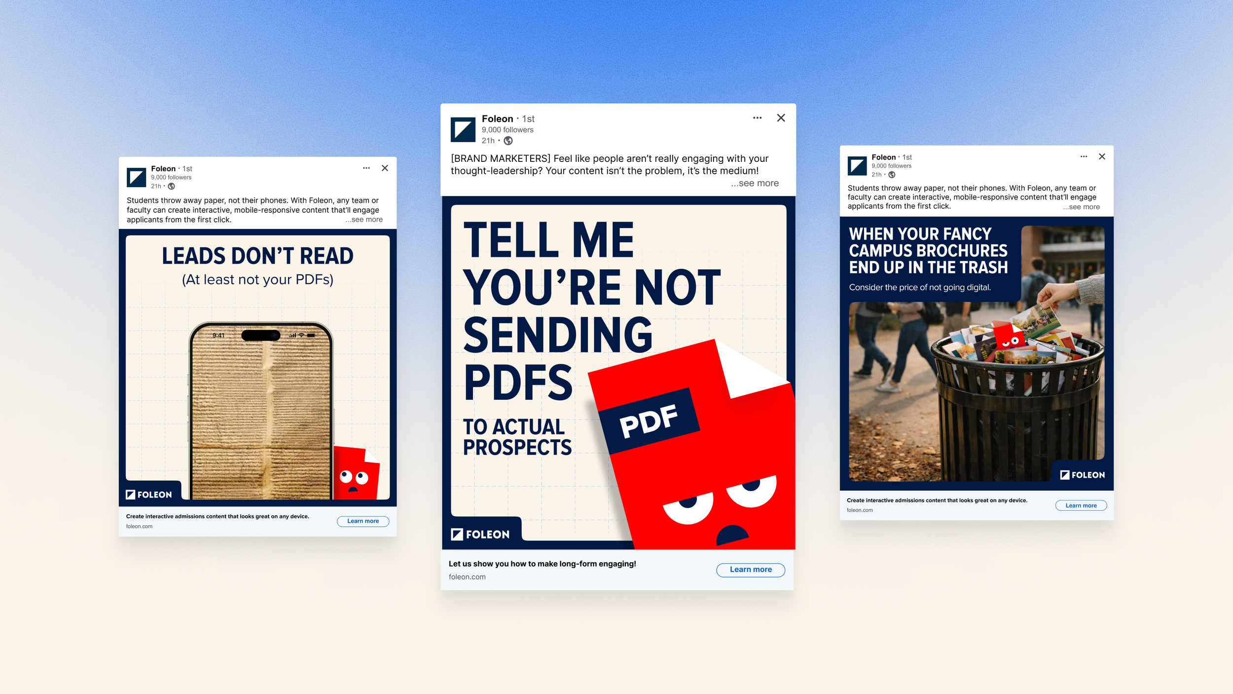
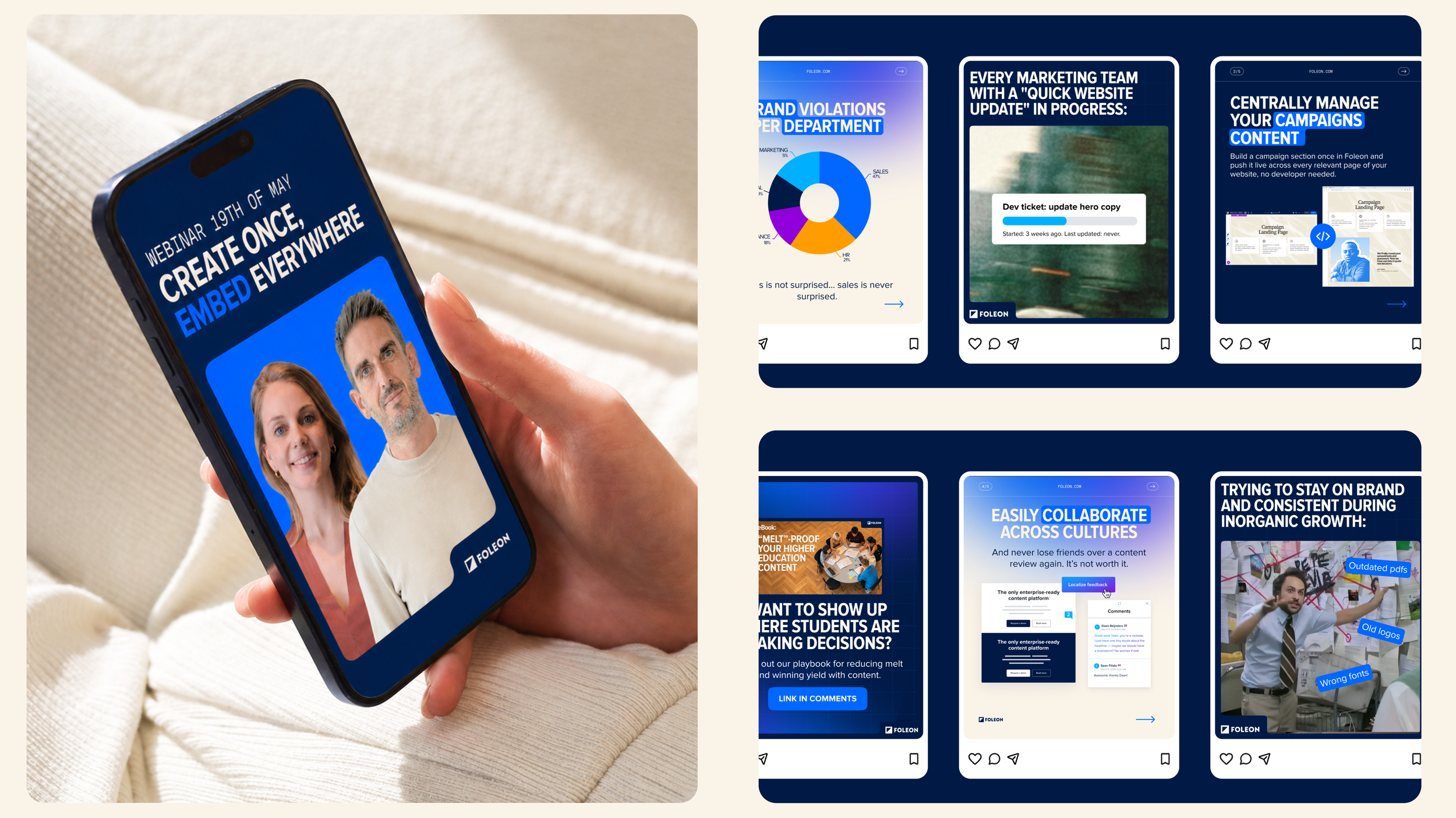
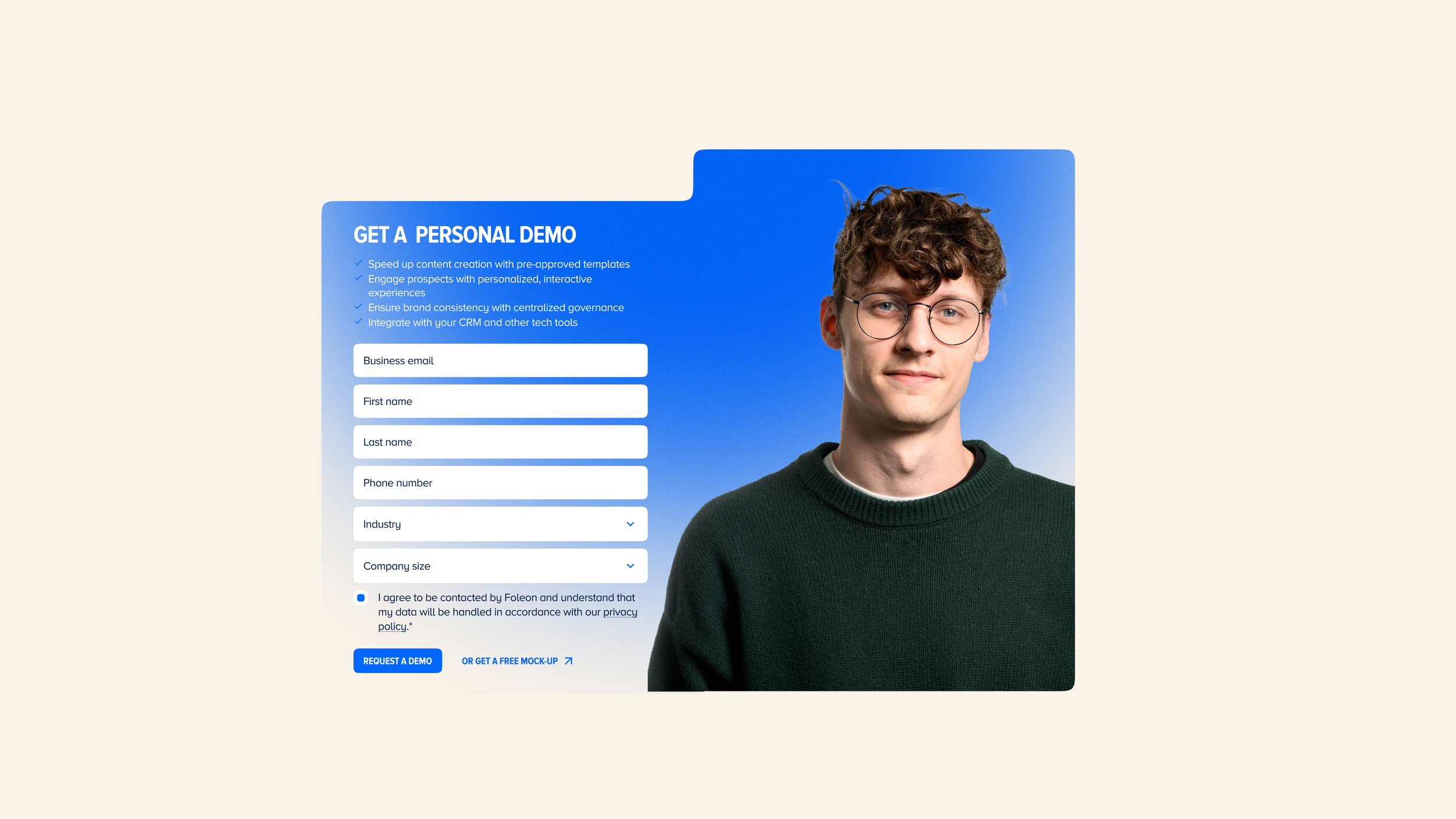
Campaigns, ads & social media
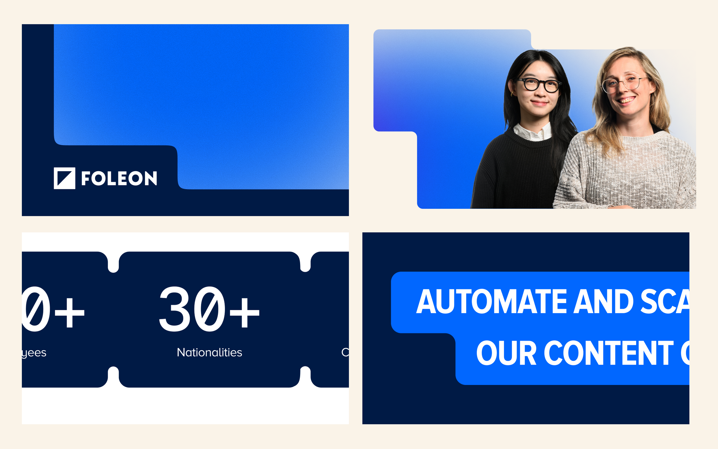
Campaigns are where the brand personality has to work hardest — straight-talking, bold, and with the wit turned up. I created a consistent set of social media templates and ad formats that gave the team creative flexibility without opening the door to inconsistency. Clear rules on color use, type hierarchy, and image style meant anyone could brief or produce an asset and know it would land on brand.
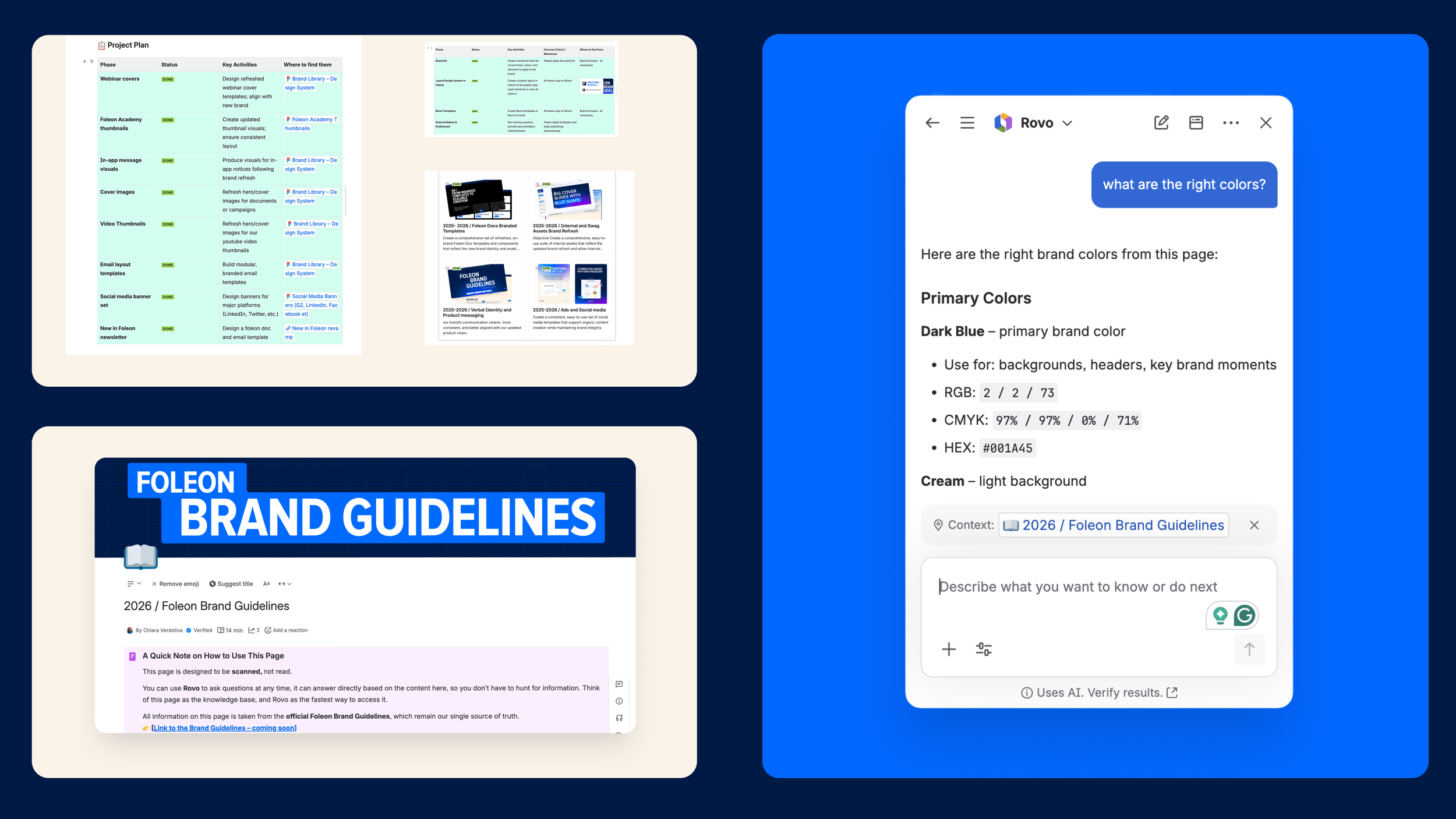
Internal docs & templates
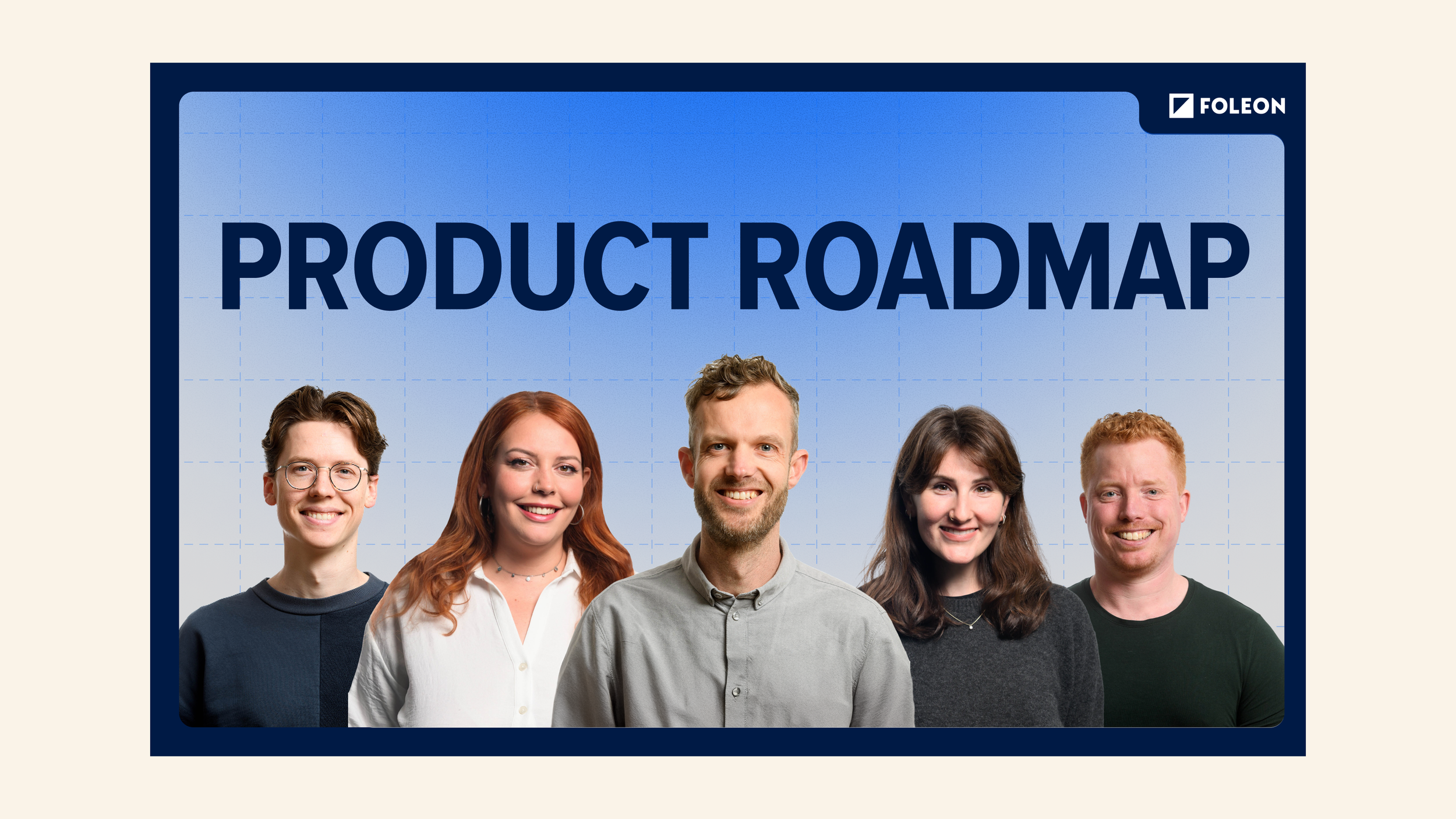
Before anyone could use the new brand, they needed the tools to do it right. I built a complete library of Foleon Doc templates, Google Slides decks, and internal assets — all wired to the updated Figma design system and Brand Console in Foleon. Every layout block, color token, and type style was locked in and ready to use. Then I ran onboarding sessions across GTM, PS, Product, and Marketing so teams could create on-brand content without needing to ask for help.
The website
The website was the most extensive and highest-stakes deliverable of the entire brand refresh. The existing site had three problems at once: it wasn't speaking to enterprise buyers, it wasn't communicating the AI-powered product, and the page structure was all over the place — navigation, hierarchy, and positioning had grown organically for years without a clear logic.
The goal wasn't a reskin. It was a rebuild from scratch.
I ran the project in three phases. Phase one was design only: I worked with Norday to focus exclusively on the six highest-converting pages. We nailed the Architect visual language, the new positioning, and the "wow" moments before a single line of code was written. Dark Blue heroes, editorial photography, bold all-caps typography, and a structure that finally put enterprise credibility front and center.
Phase two was development. I brought in external developers to move fast without losing quality, and led the collaboration between them and internal stakeholders simultaneously. We built the new site in HubSpot from scratch, a component and variable-based repository that made every page consistent, scalable, and easy for any team to maintain going forward. The first six pages went live as a complete, polished launch. Then we converted the rest of the site, page by page, until the full domain reflected the new brand.
Credits
Throughout the entire process, I worked under the support of Richard Francis, VP of Marketing, who championed the project at the executive level, helped me keeping the senior stakeholders aligned, and gave me the space and trust to drive the creative direction end-to-end.
Copywriting across the brand guidelines and verbal identity was handled by Clementine Jones, whose sharp pen brought the voice to life. In the early stages of the project, Massimo Meijer provided valuable mentoring that helped shape the strategic direction. And a special mention to Giacomo Rossini, who joined as an intern and contributed with energy and curiosity during the execution phase.