The brand was experiencing some inconsistency as well as adapting to changing market needs.
Refreshing our brand helps us stand out from competitors and differentiate ourselves in the marketplace. By refreshing our branding to be more mature, relevant, and unique, we better support the business objectives.
Consumer behaviors and preferences change, and we need to adapt to stay relevant. Refreshing our brand signals customers that we are aware of their changing needs and are ready to meet them.
As the business expands and undergoes changes over time, we often face the challenge of maintaining a cohesive message across all our touchpoints. This lack of focus can lead to confusion among customers and make it difficult for the brand to establish a strong and consistent identity.
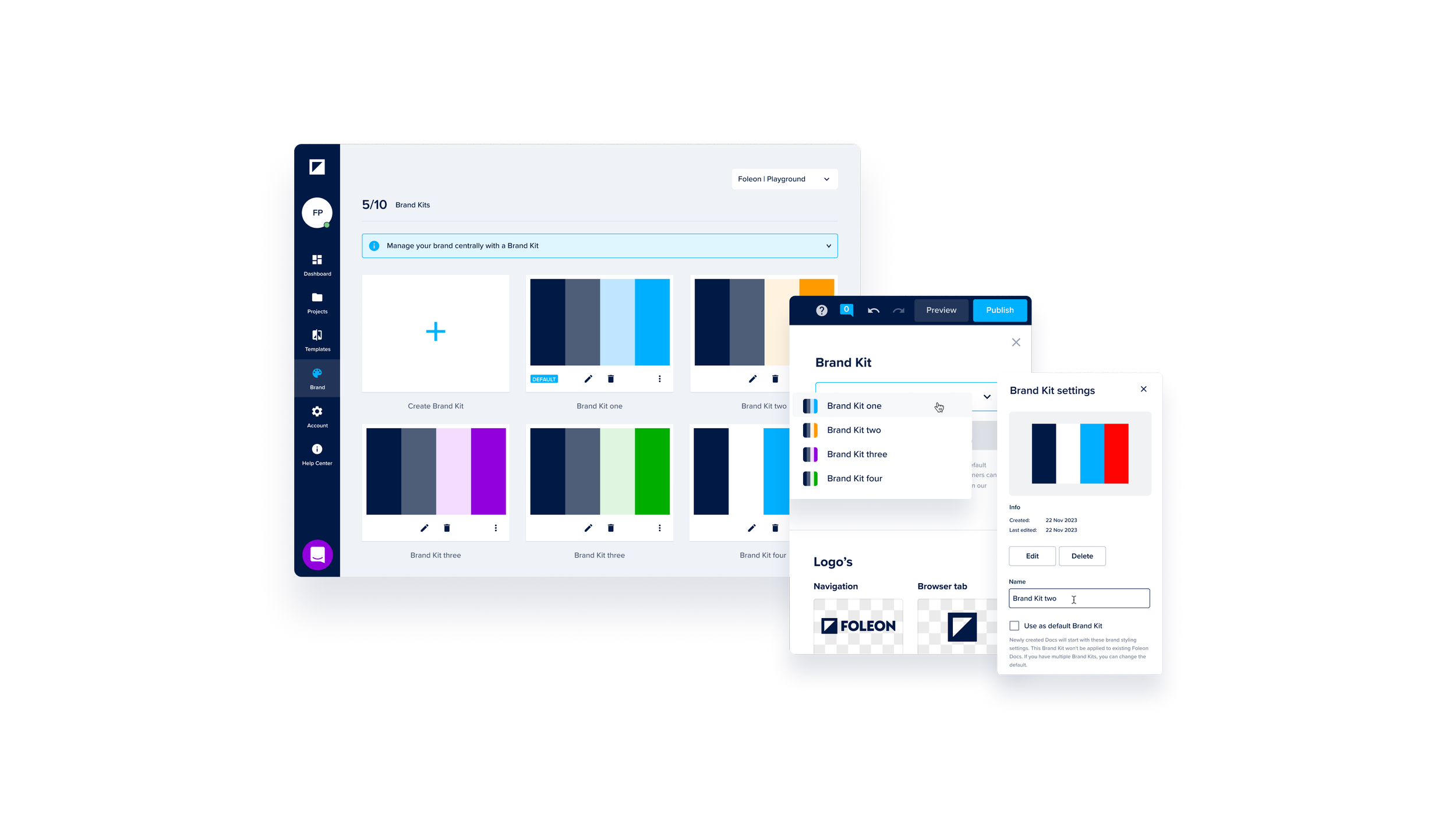
My role as the Creative Lead was to focus on visual research, analysis, design, creation, and implementation of the new brand guide in collaboration with our Head of Brand and the marketing team.
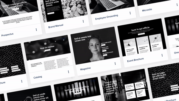
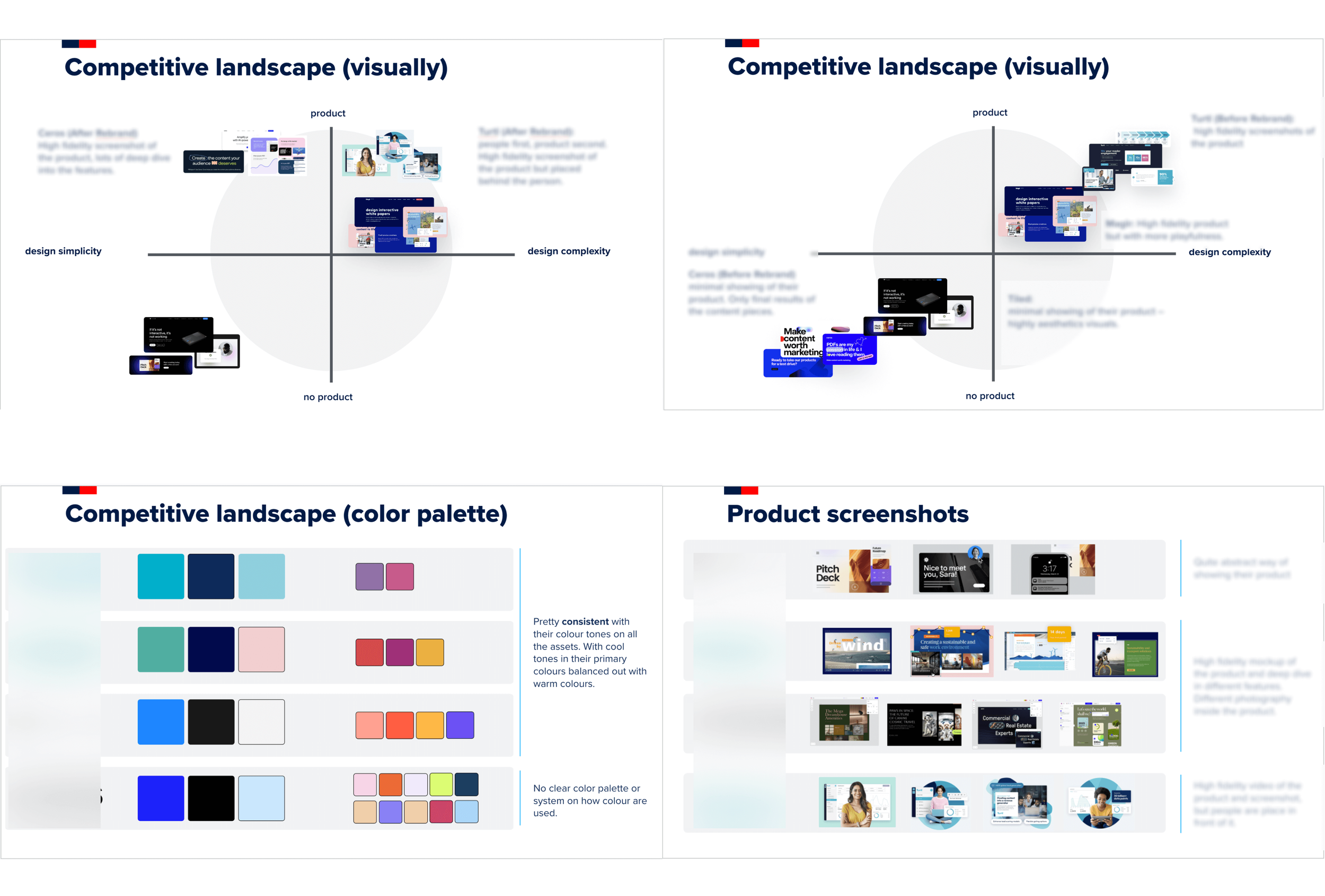
Analysis of the old shape based visual identity
-
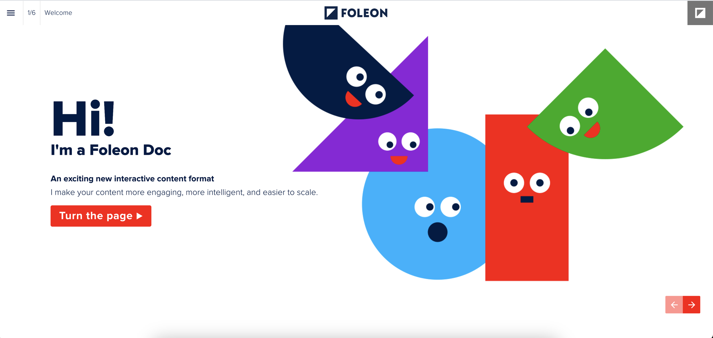
The existing shape identity system can be fun and engaging. As the brand guideline states: “The shapes have a strong visual effect, so use them in moderation, as they lose strength when they are used too often.” Shapes have taken center stage in defining our brand. They play a prominent role in various elements such as headers, backgrounds, blog covers, Foleon documents, images, and icons. From the brand guide: “Try to create illustrations that complement the text, but don’t forget this one is the protagonist”.
-
When text covers shapes with different colors, it causes issues with reading and seeing clearly. This makes it hard for everyone, especially those who need better contrast or accessibility.
-
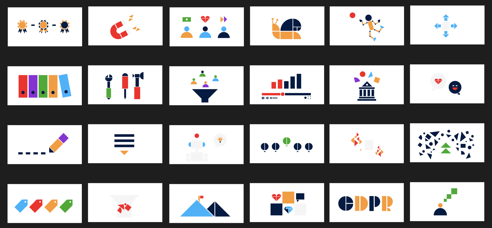
Numerous styles are used for the shapes, ranging from abstract backgrounds to more literal representations like cars or flowers. These styles evoke two very different emotional responses and brand feeling.

Competitive Research
Research to understand current brand perception, customer feedback, and competitive landscape.
*Images have been blurred for privacy reasons.
Brand refresh principles
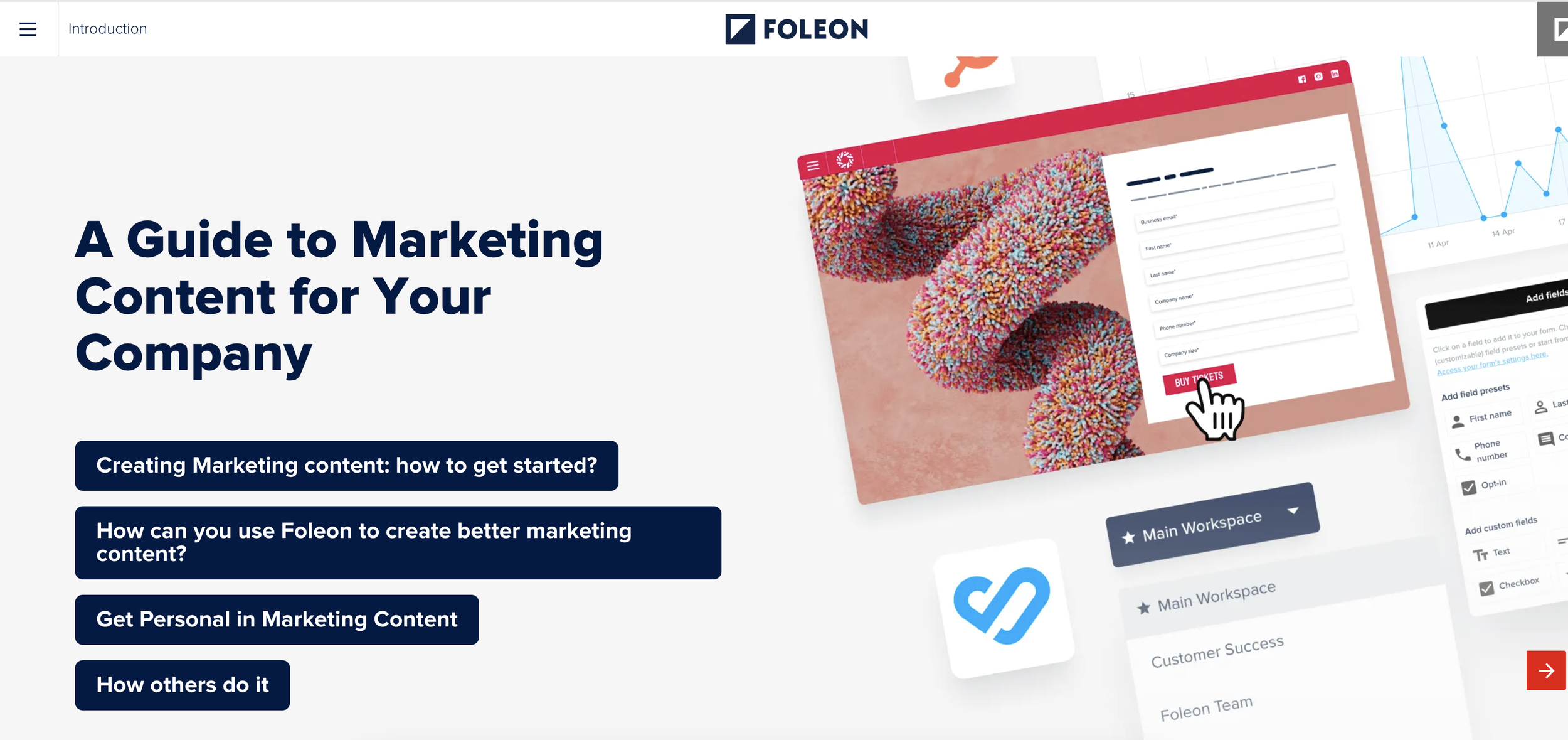
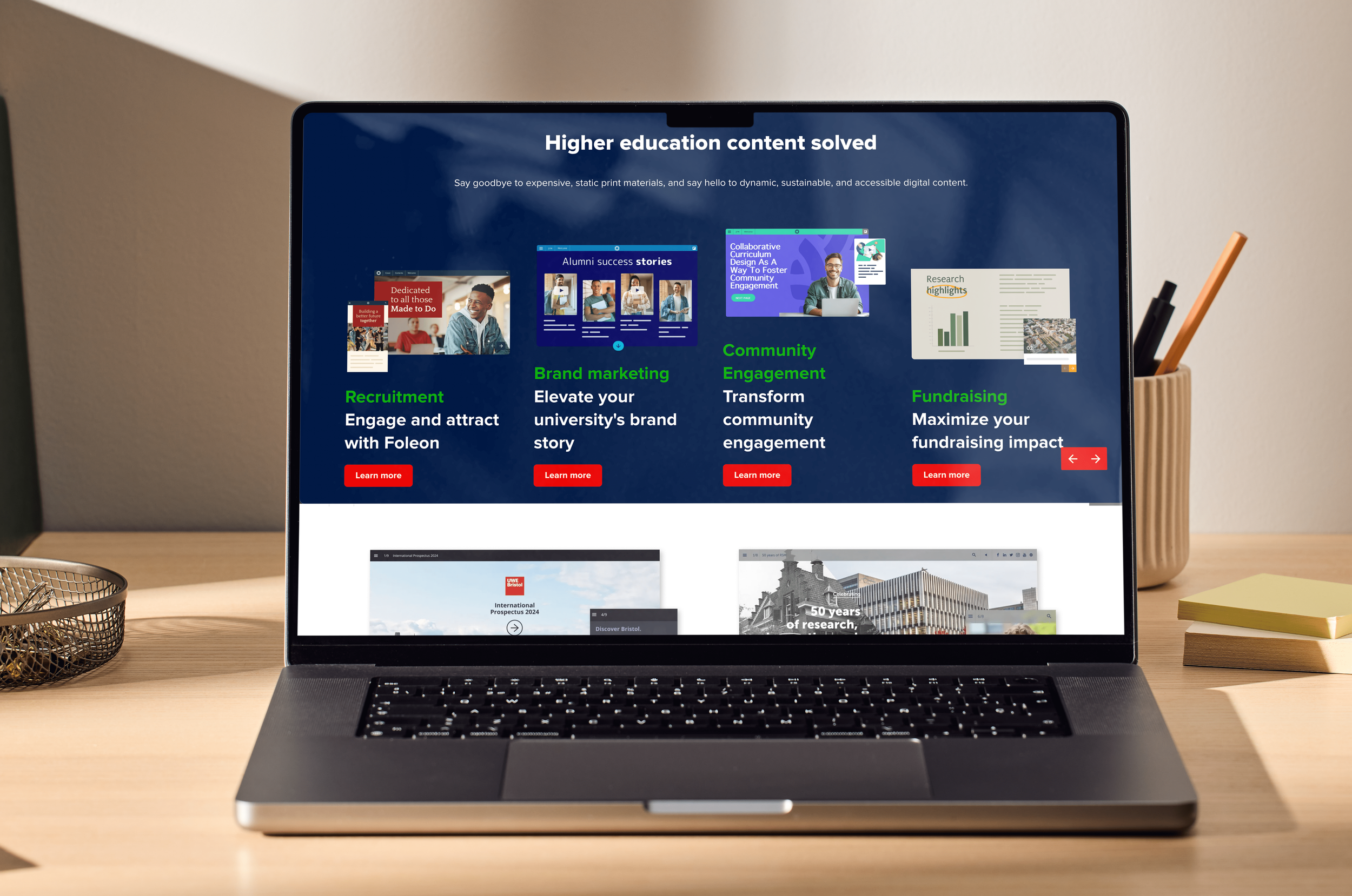
Foleon is a product-led organization, and that's reflected in our primary visual style.
Our brand identity is about challenging the content norms and offering new perspectives. That is why we use a dynamic effect, creating bouquets of product visualizations or concepts rotated at a 10-degree angle.
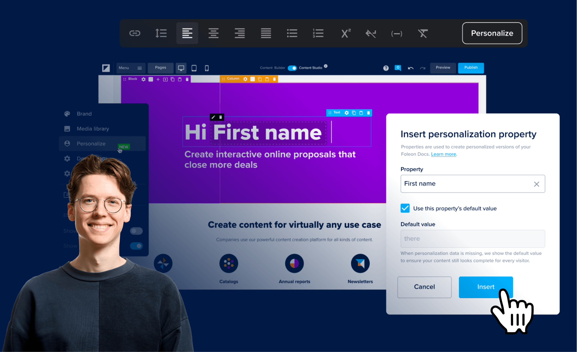
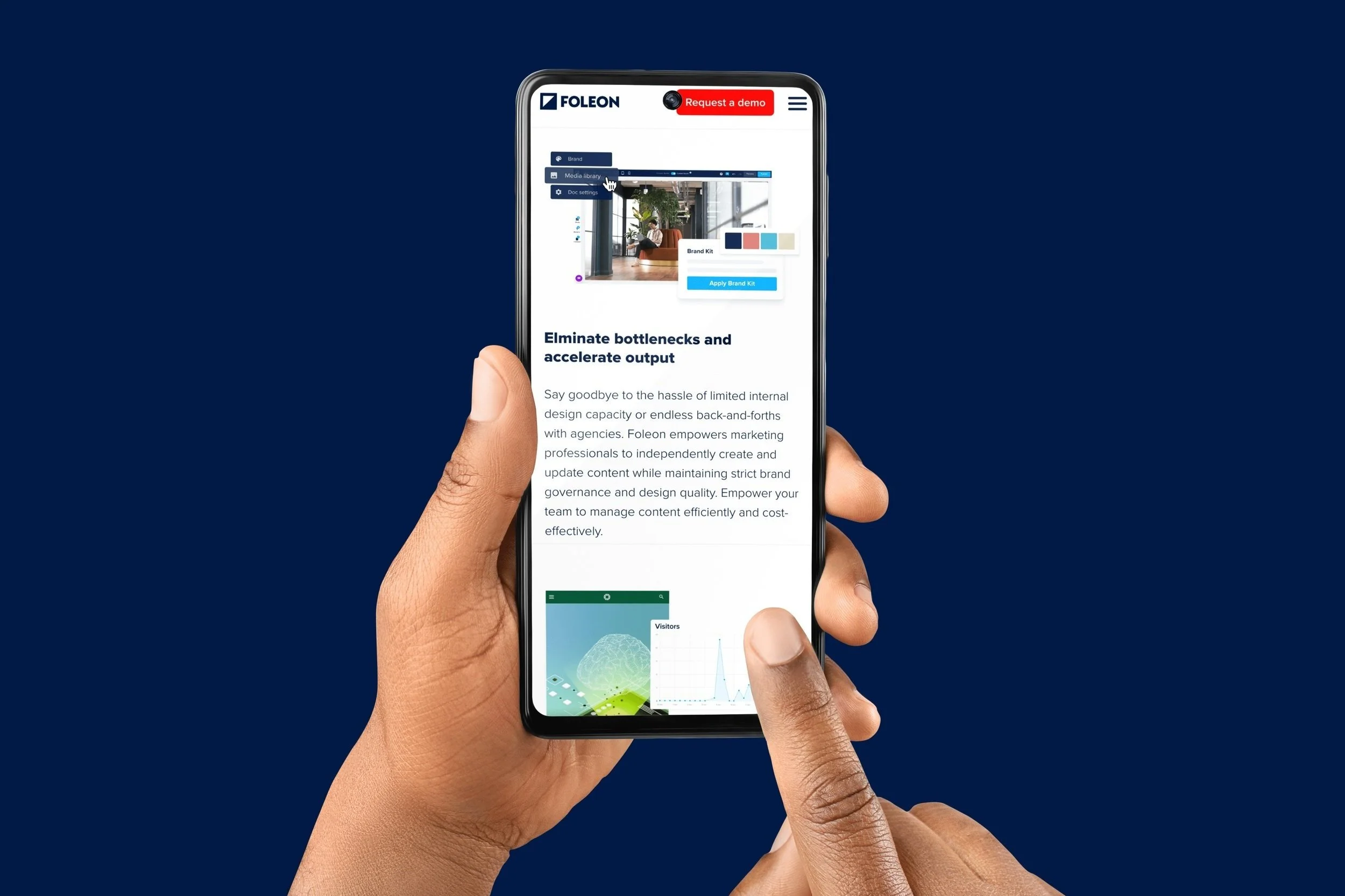
Our product and brand wouldn't exist without the people making it happen.
Use this style when creating subject-matter expert content. By blending the visuals of both the product and people, we humanize our brand. In this case, we bring our team into the spotlight and our product visualizations have a supporting role.
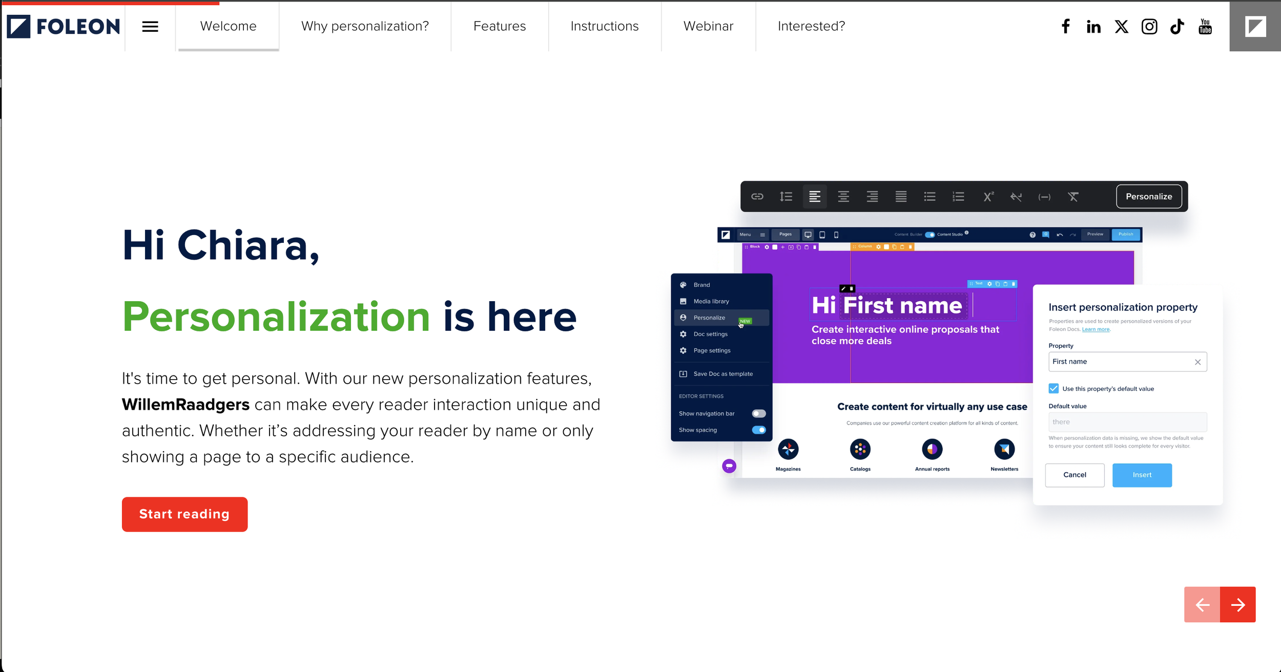
Dynamic, clarity, and readability layouts.
Achieving visual balance in design involves evenly distributing elements like colors, images, and typography to create equilibrium. Hierarchy establishes importance, guiding the viewer's eye through size, color, contrast, and spacing while emphasizing key elements. Whitespace, or negative space, enhances readability and clarity by providing empty areas that allow important elements to stand out and add elegance.