Foleon Summer Launch Campaign: Content is everywhere. Here, it's yours again.
The Summer Launch was Foleon's biggest product moment of 2026, building towards the launch of the Grid AI Editor and Asset Manager. The goal: drive adoption of the new features and reposition Foleon in a market where AI had quietly scaled brand inconsistency across every content team. One of our most visible cross-functional efforts of the year.
I defined and directed the creative concept and art direction for the launch. Starting from the approved brief and workshops with Product and Sales, I developed the campaign narrative with our copywriter — Content is everywhere. Here, it's yours again — and presented the concept to executive stakeholders for alignment and sign-off. From there I built it into a visual system that held across magazines, paid social, display, landing pages and the launch event, and led the collaboration with copywriters, content marketers and designers to keep tone of voice and visual language consistent throughout.
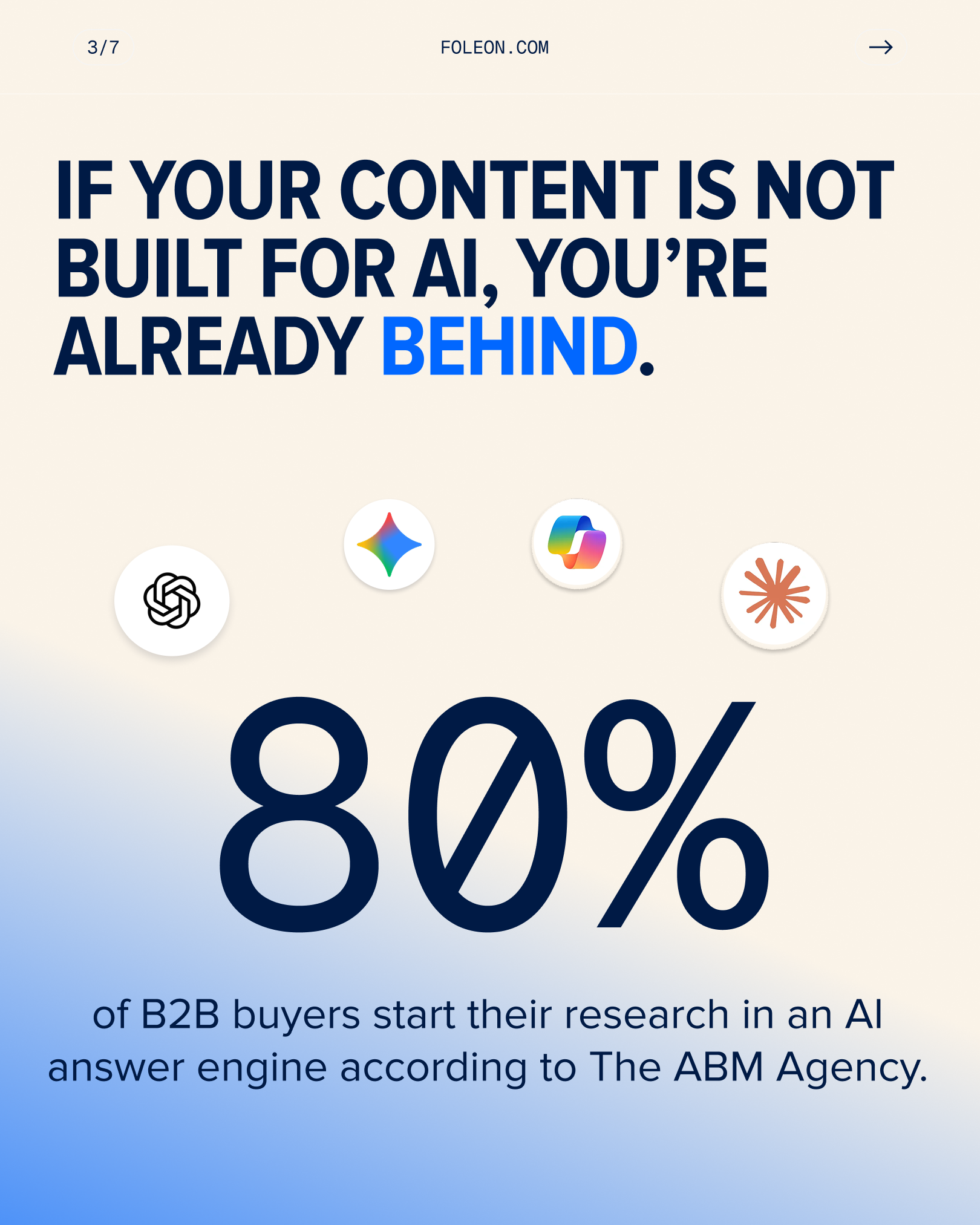
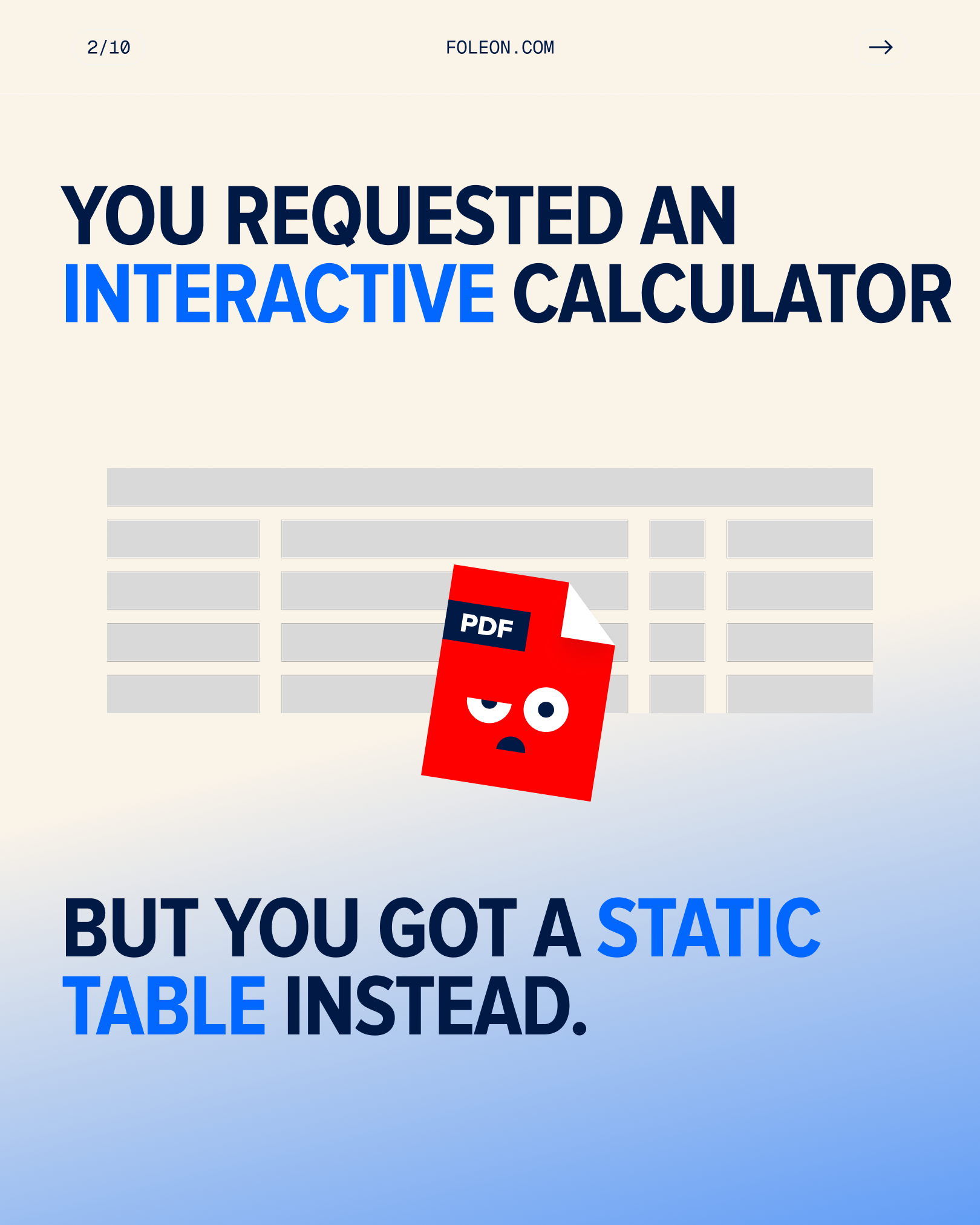
Marketing teams had lost control of their own content. Not through laziness — through volume. Then AI scaled that inconsistency beautifully.
94% of marketers say brand consistency is their top concern as AI creation spreads. Only 9% think their current tools are fixing it. (Forrester x Canva, 2026)
So: a product launch that had to feel like a position, not a feature list.
The line, and why it holds
Content is everywhere. Here, it's yours again.
Eight words doing four jobs. Here means in Foleon, set hard against everywhere out there. Yours is your standards, your context, your brand. Again is the turn — control, returned. You set the direction, not the tools, not the algorithm.
I built the whole system off that one sentence. Every asset is a variation on it: here, it's governed. Here, it reaches the right people. Here, it's exactly as you intended.
Copywriter: Clementine Jones
Art direction
Everyone in this category defaults to grids, glow and abstract data. I went the other way.
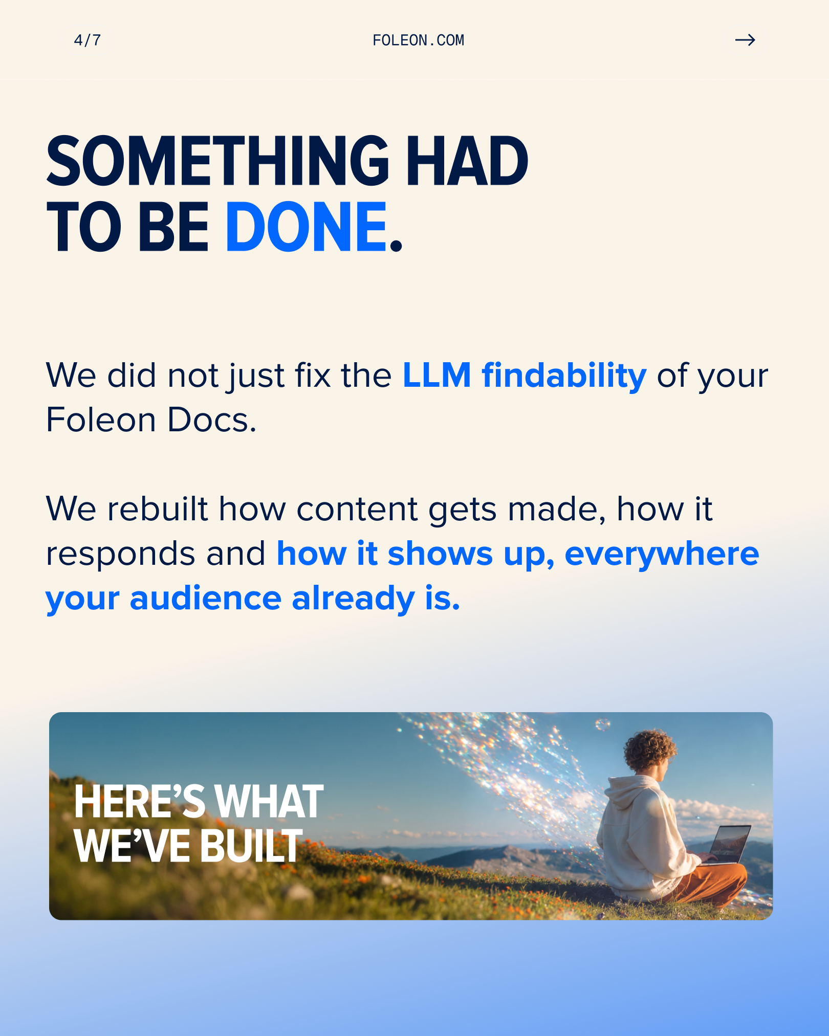
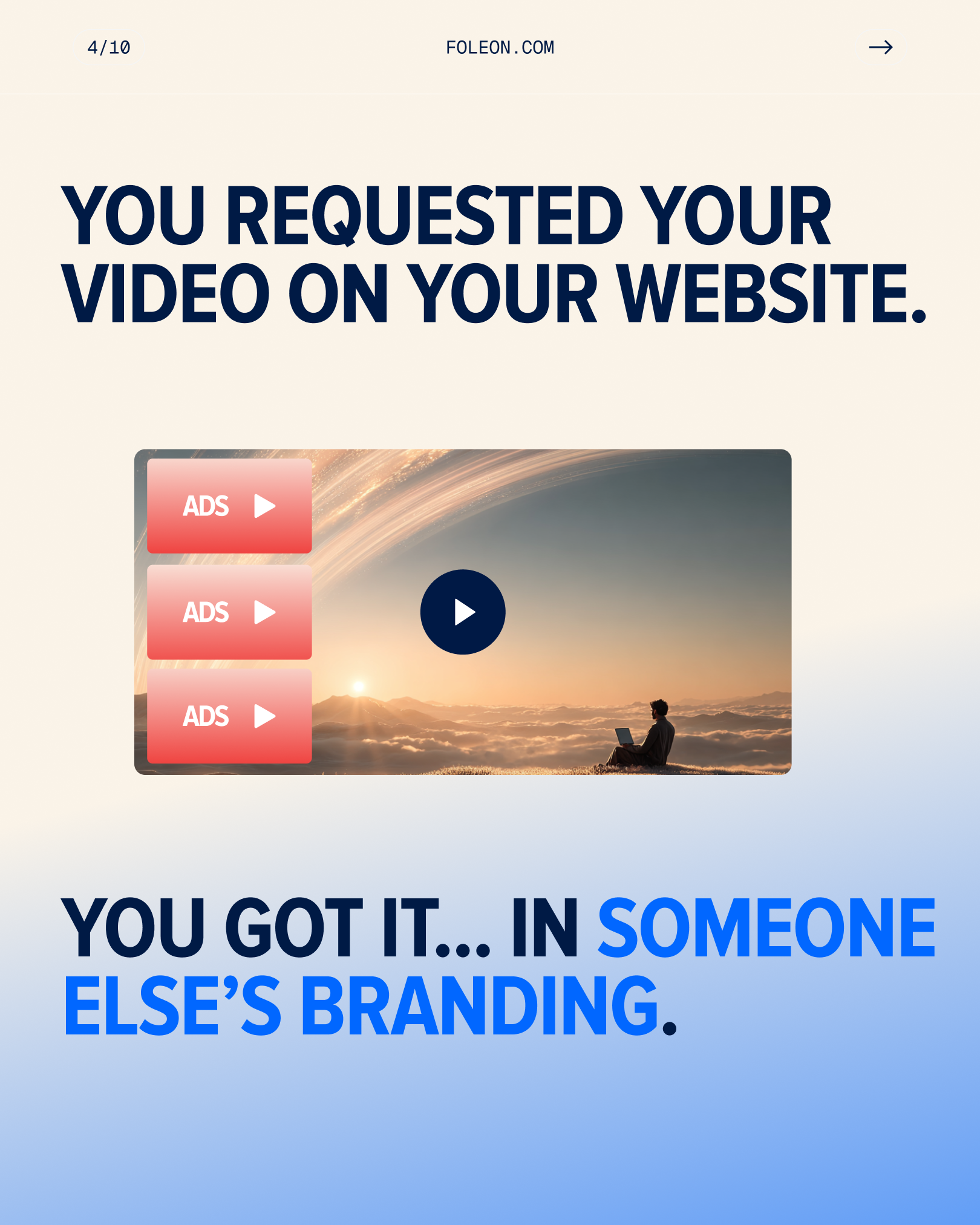
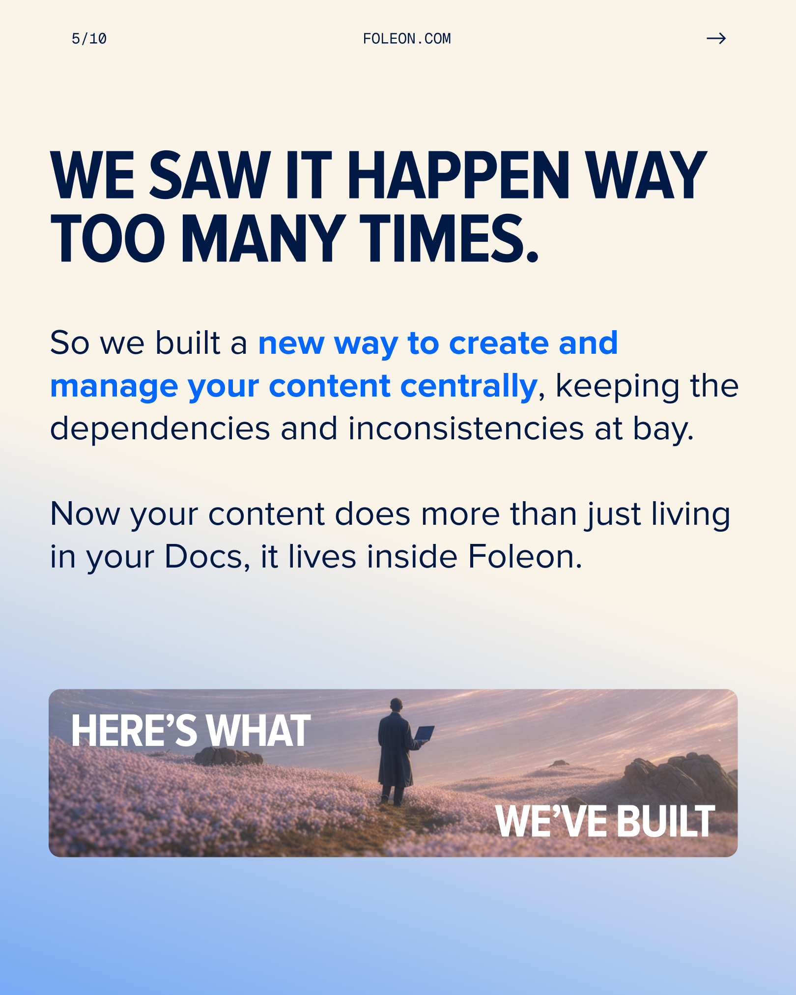
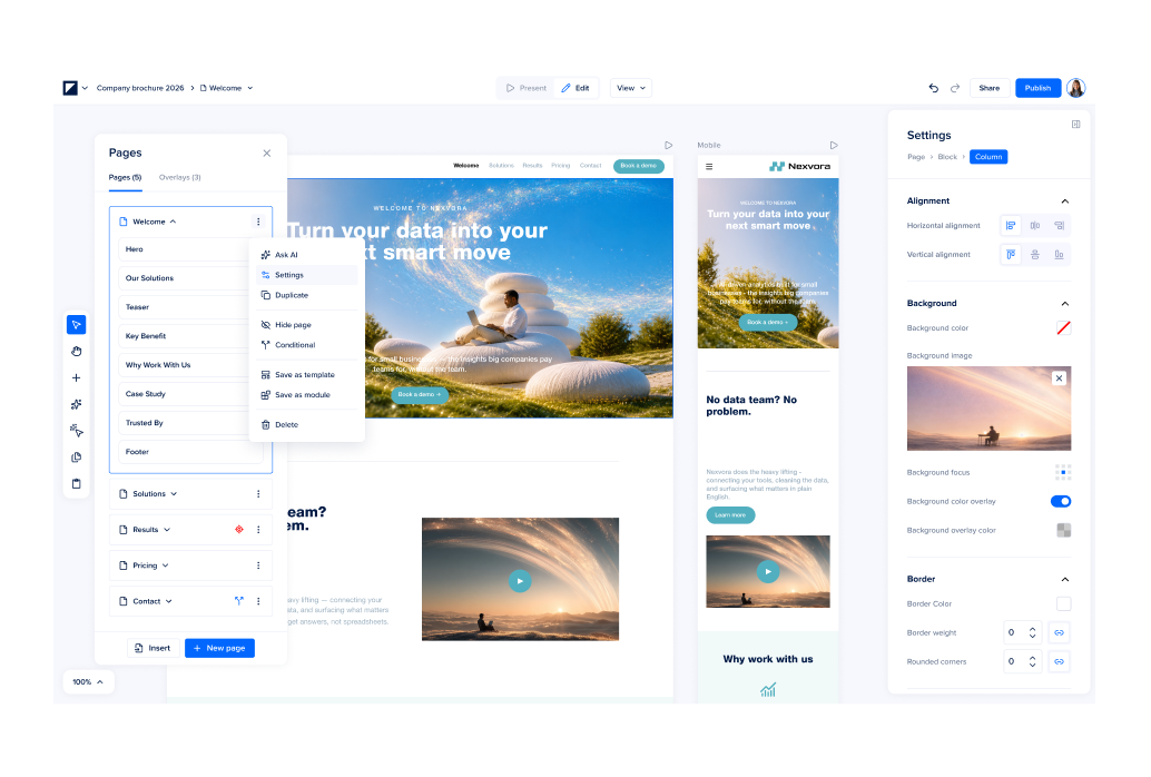
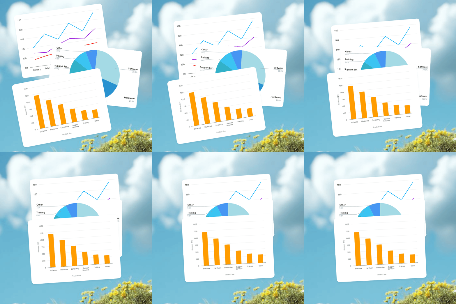
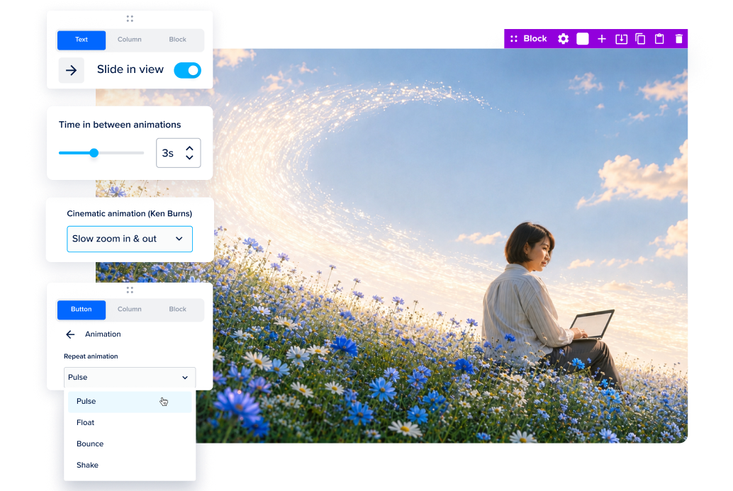
Cinematic open landscapes, dunes, wildflowers, weather rolling in. One person with a laptop in the middle of it, sitting still. The world moves; they don't. That's the whole argument in a single frame, before anyone reads a word.
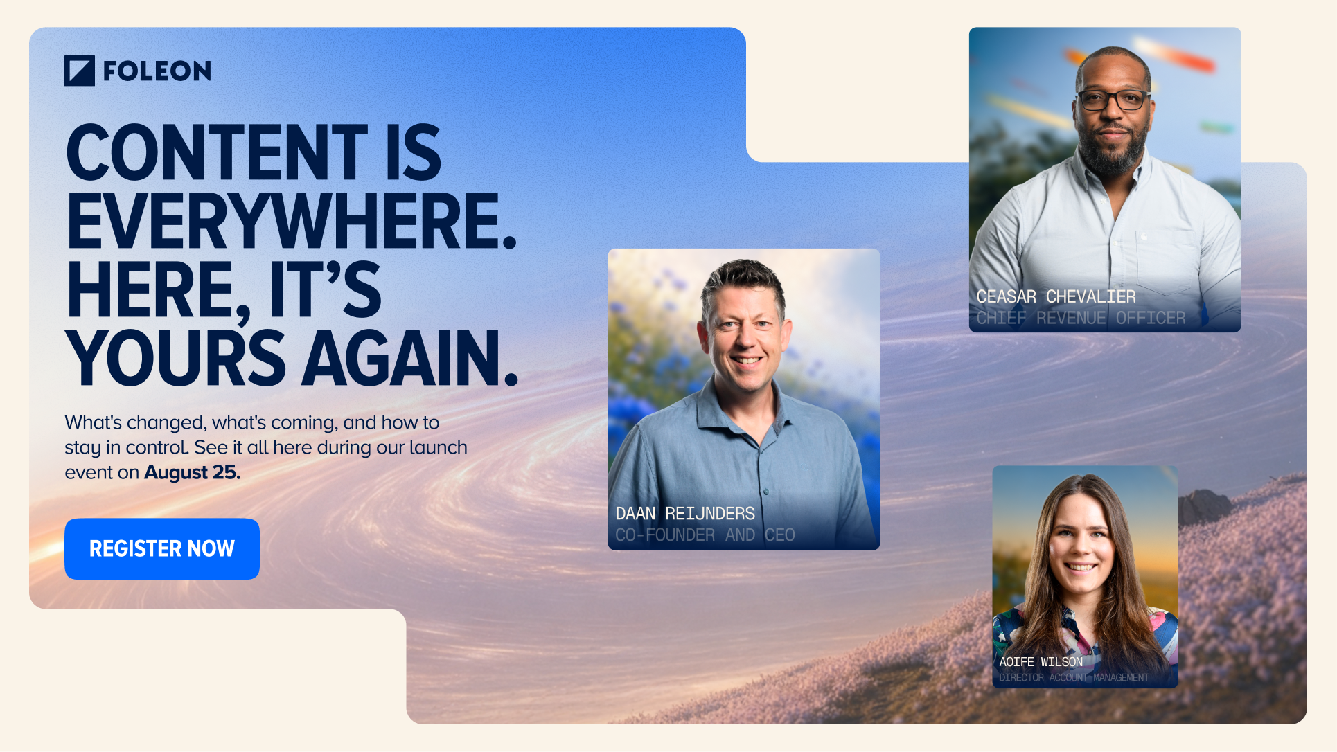
The type device does the rest. Outlined boxes around everywhere, here, yours, again — so the eye lands on the four words carrying the meaning, and the line survives being cropped to a 300x250.
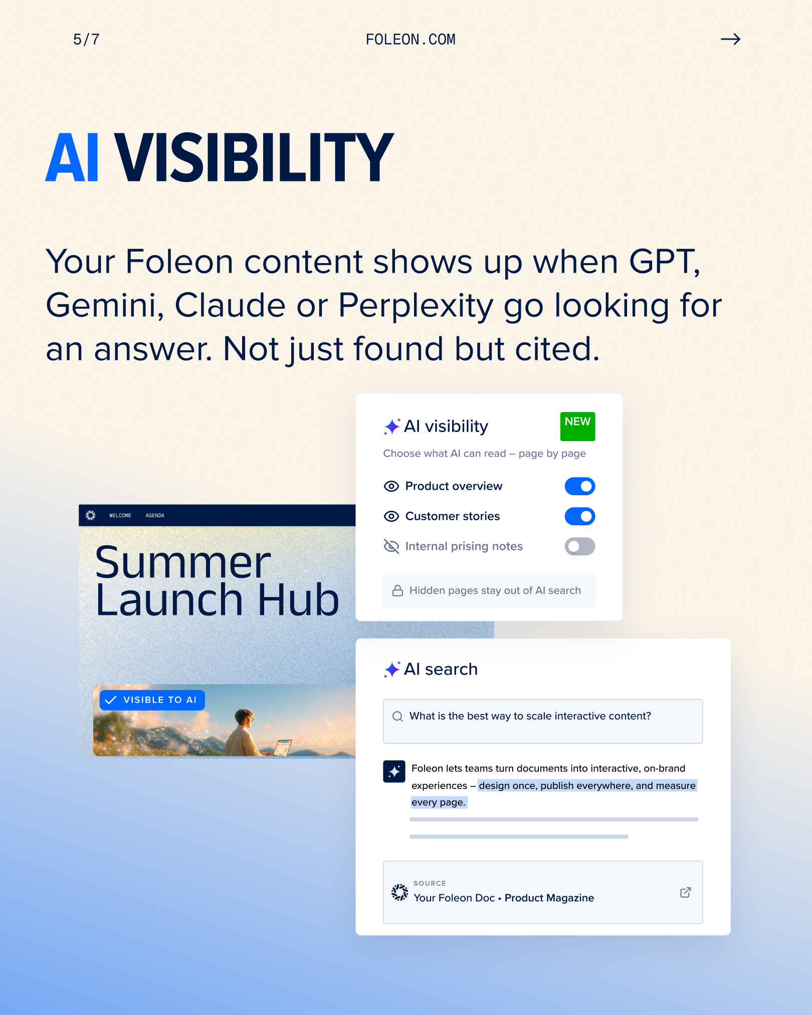
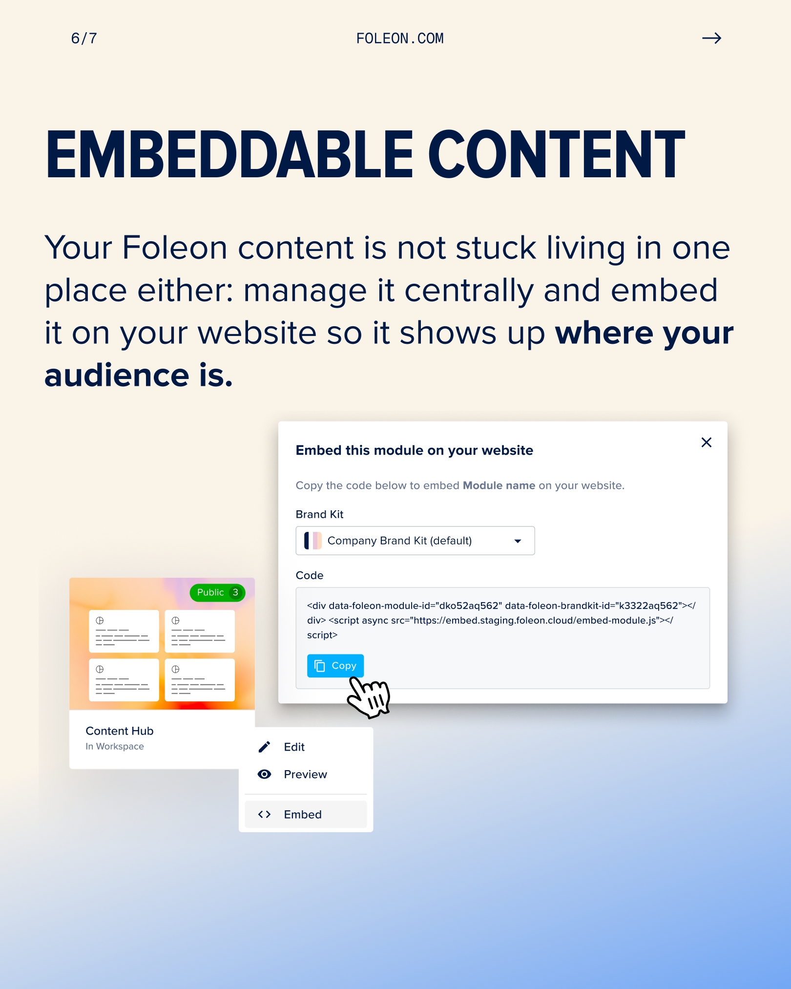
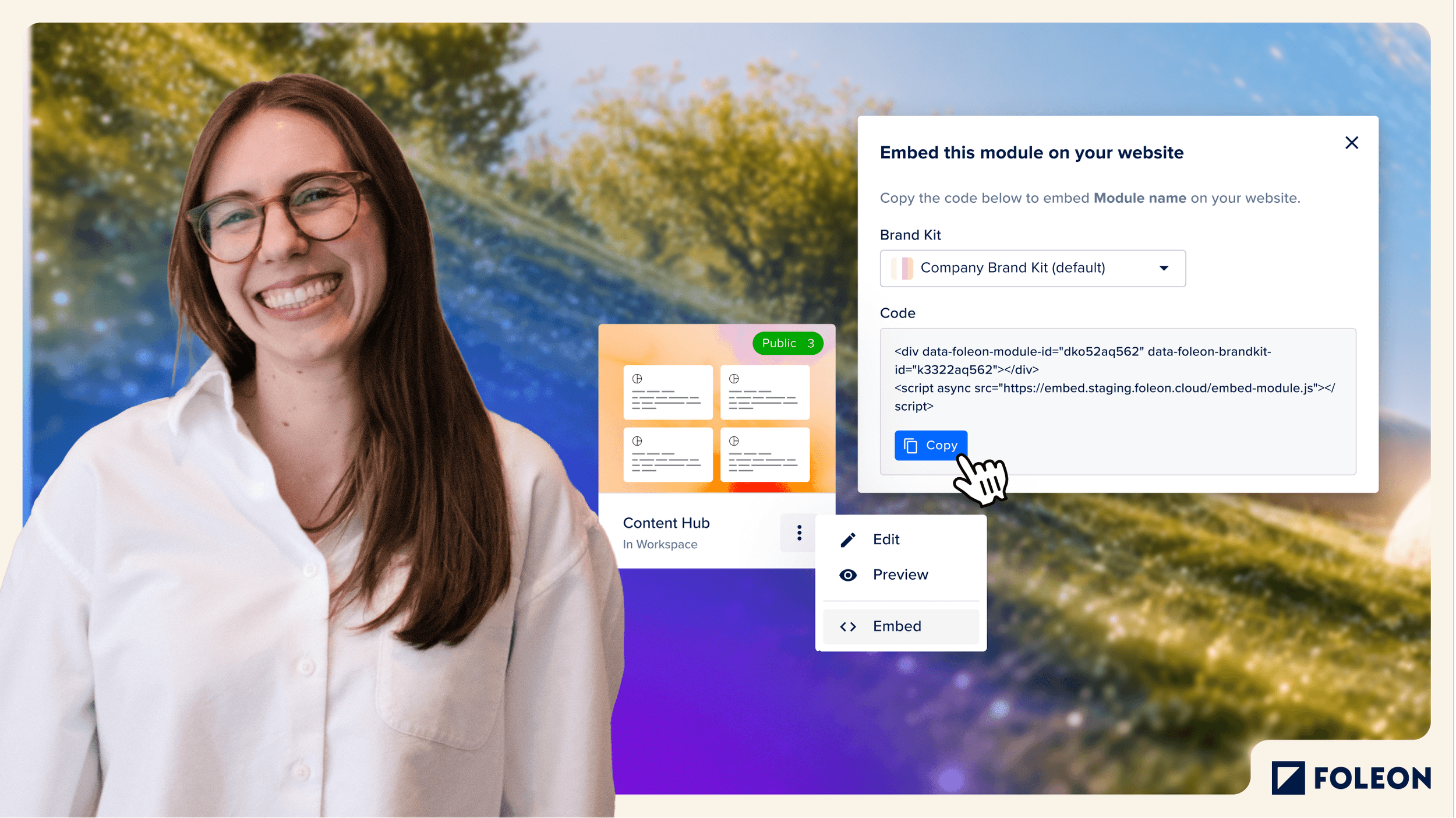
And the product stays the hero. The landscapes never replace the screenshots, they frame them. It's a launch, not a perfume ad.
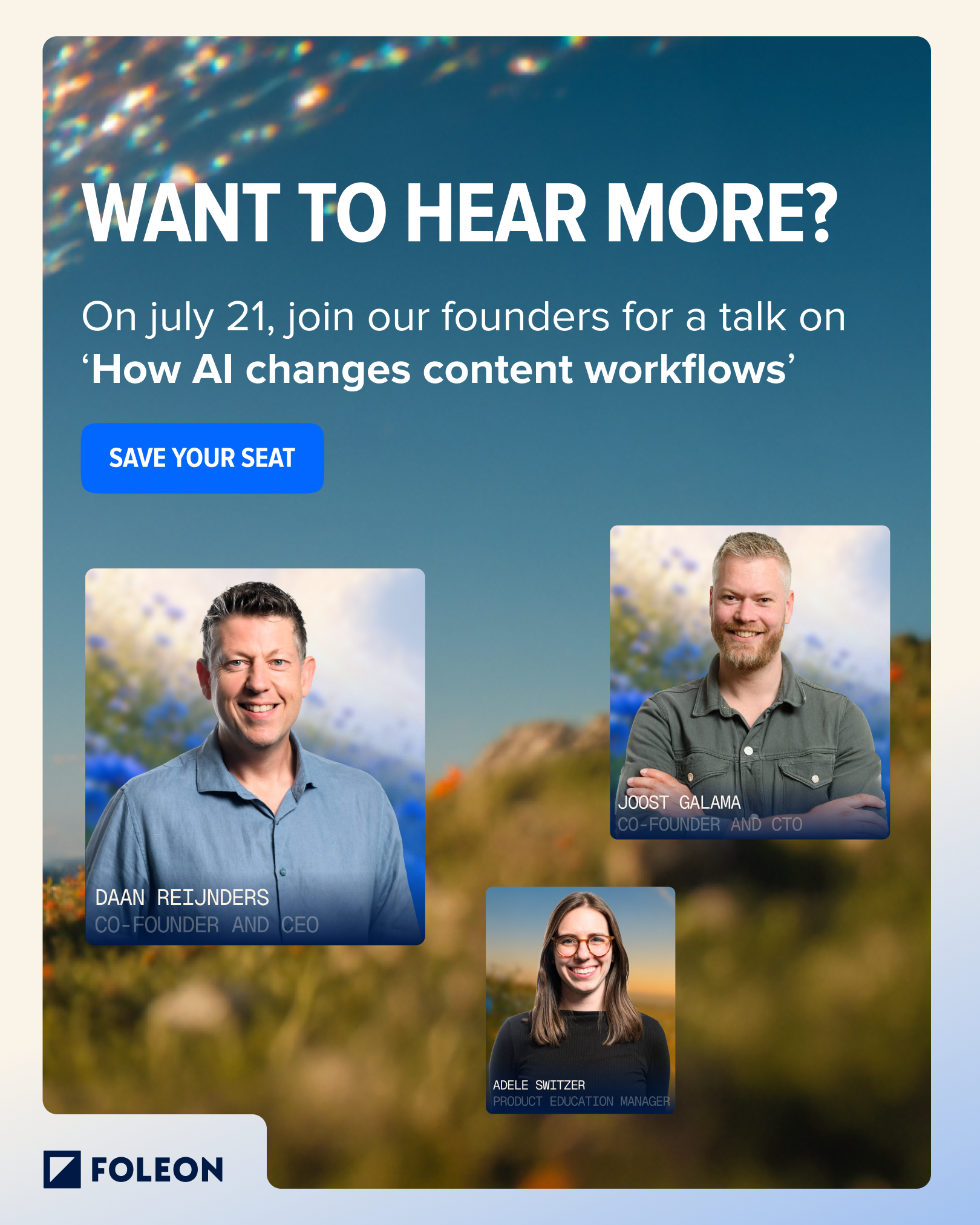
Magazines, paid social, display, landing pages, organic, a webinar, a launch event.
Same line, same landscape language, different crop each time. Vertical for social, letterbox for display, full-bleed for the magazine cover. Subtle motion throughout, the world keeps moving even when the frame is still.

What the numbers said
Then I went and checked if it actually worked.
3,463 people came to the Summer Launch Hub. They stayed 3m 23s on average — which, for a product launch page, means they read it rather than scanned it. The AI pillar page held people for 2m 42s and only 20% bounced. A quarter came back a second time.