A strategic Homepage redesign
Our homepage had become outdated and ineffective, both visually and strategically. The design lacked a modern aesthetic and failed to reflect our brand’s value proposition. Messaging was unclear, with no strong hierarchy or focus on what made our product unique. The layout was cluttered, navigation was unintuitive, and the overall positioning was not well-defined. As a result, visitors were not engaging with the content, and conversion rates remained extremely low. We were missing countless opportunities to capture leads and communicate our core message effectively.
Approach & Outcome
To address these issues, we completely reimagined the homepage experience, from structure and storytelling to visuals and functionality. We partnered with Fletch, an external agency that helped align key stakeholders and refine our brand positioning.
The new page attracted 14,145 users, showing a 5.7% increase in traffic and a slightly longer average session of 1 minute and 55 seconds.
My role
As project lead, I guided the initiative from concept to launch, overseeing both strategy and execution (all while being 39 weeks pregnant 🦸♀️) I organized and facilitated cross-functional meetings with the agency and internal teams, audited the existing site, designed key layouts myself, and coordinated closely with developers to ensure a smooth rollout. Despite the timing, the project was delivered on schedule and exceeded performance expectations.


Every section of this page has been carefully designed and purposefully balanced, where content and visuals work together to tell a single, cohesive story. After visually rich sections above and below, the Social Proof block takes a more grounded approach: a calm, copy-led layout that highlights real success stories backed by authentic data.
Each customer story dynamically adapts with changing metrics, showcasing measurable impact across industries and teams. Further down, the Use Case carousel brings our platform to life — combining visual cards and concise text to present the key ways customers use our solutions.
Each slide pairs client quotes with the actual assets they’ve created using Foleon, grounding testimonials in tangible proof of creativity and results. The content may evolve, but the structure, thoughtful, modular, and storytelling-driven, is here to stay.
You’re not just creating content — you’re making a difference.
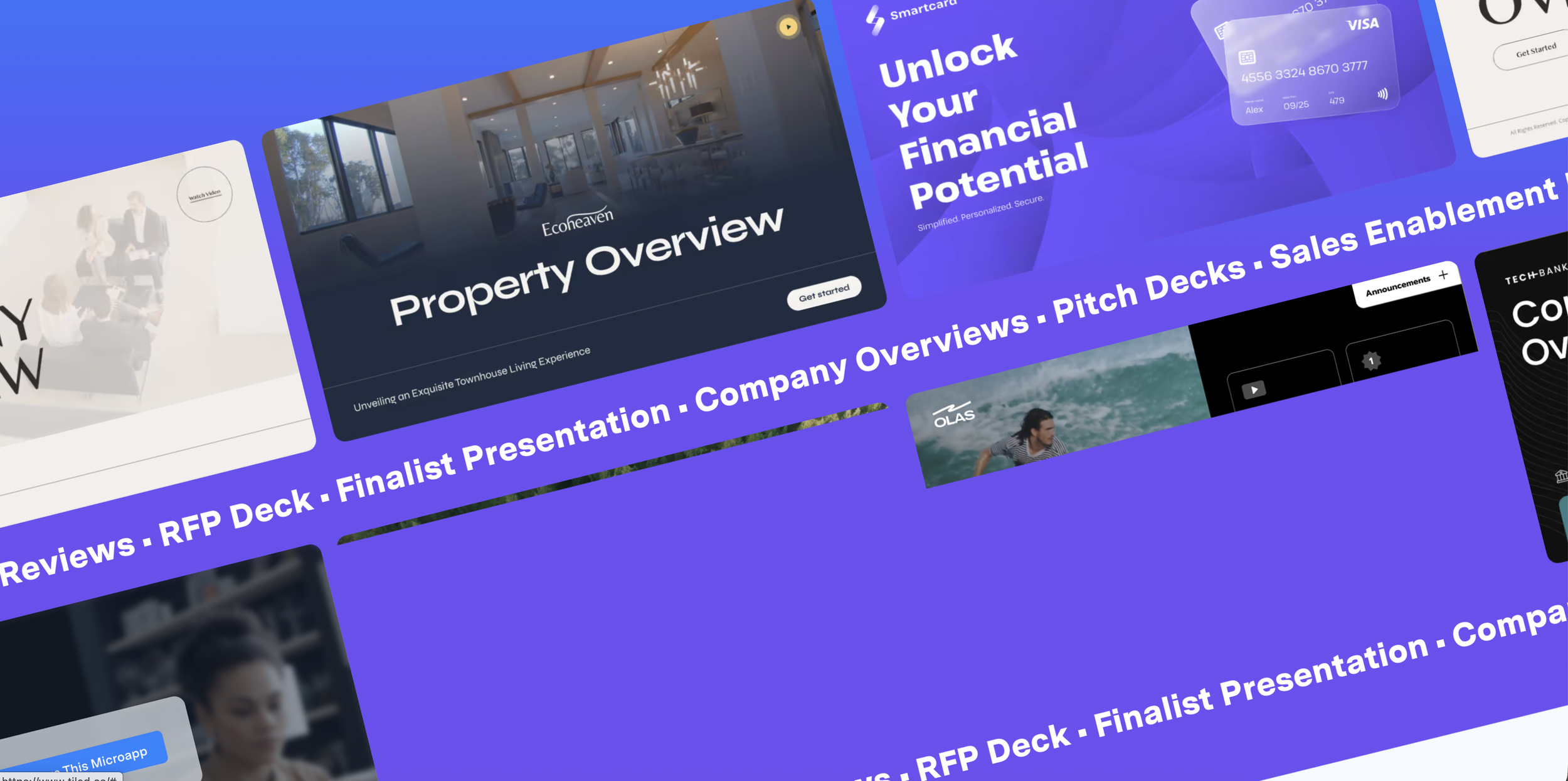
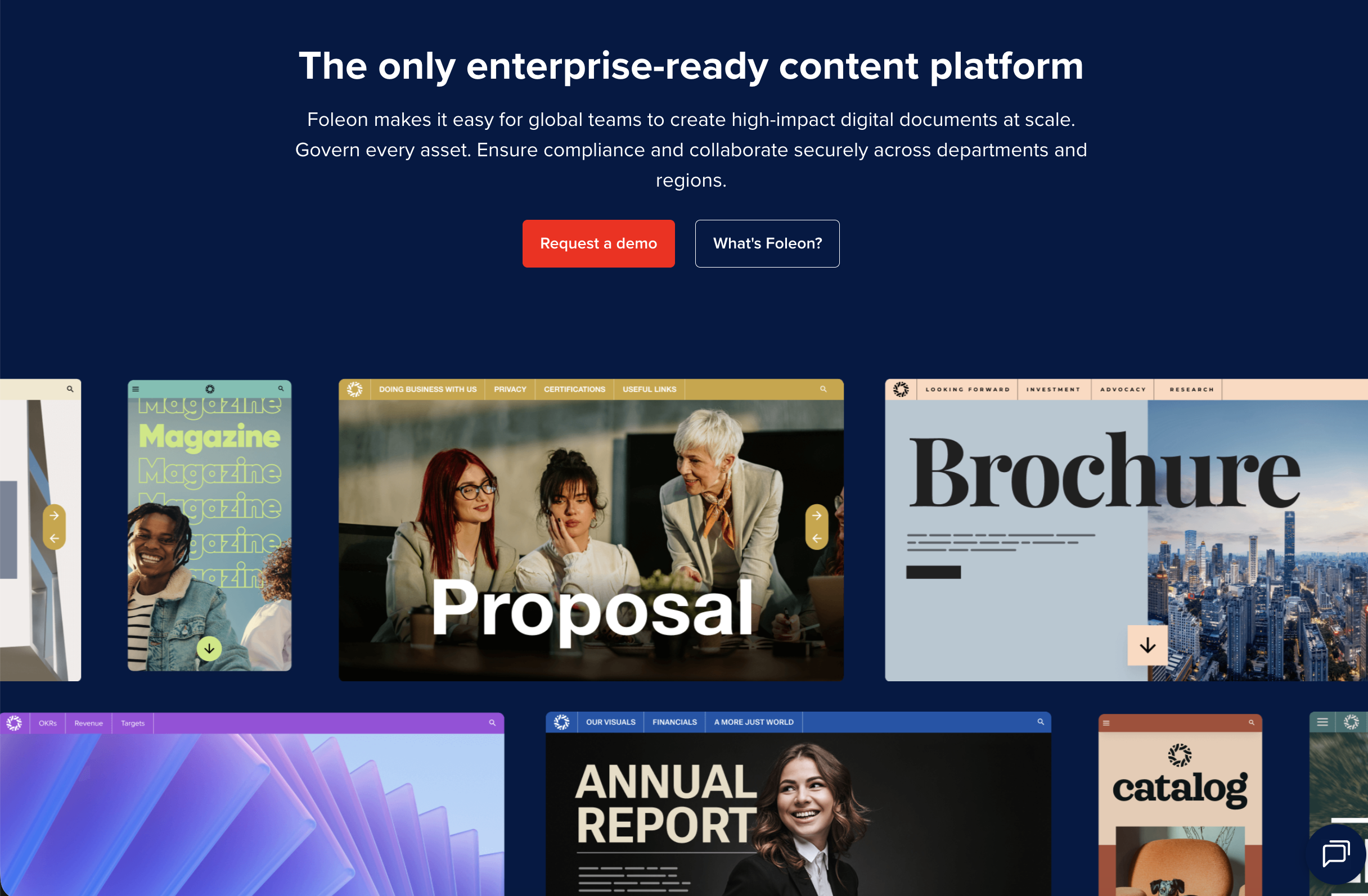
Concept: Showcase the output of our major industries (financial, corporate communications, legal, real estate, higher education) on both mobile and desktop platforms. The goal is to ensure that users who scroll can easily understand what "asset creation" or "business documents" we are talking about. We also want to have a cool stopping power.
Imitation is the sincerest form of flattery — and apparently, our competitors are huge fans ;)