Less browsing. More buying
Foleon grew up. The website didn’t.
The product had gone enterprise. AI was built in. The buyers cared about governance, compliance and keeping their brand intact across hundreds of documents... and the site was still talking to someone else.
So we rebuilt it.
Approach & Outcome
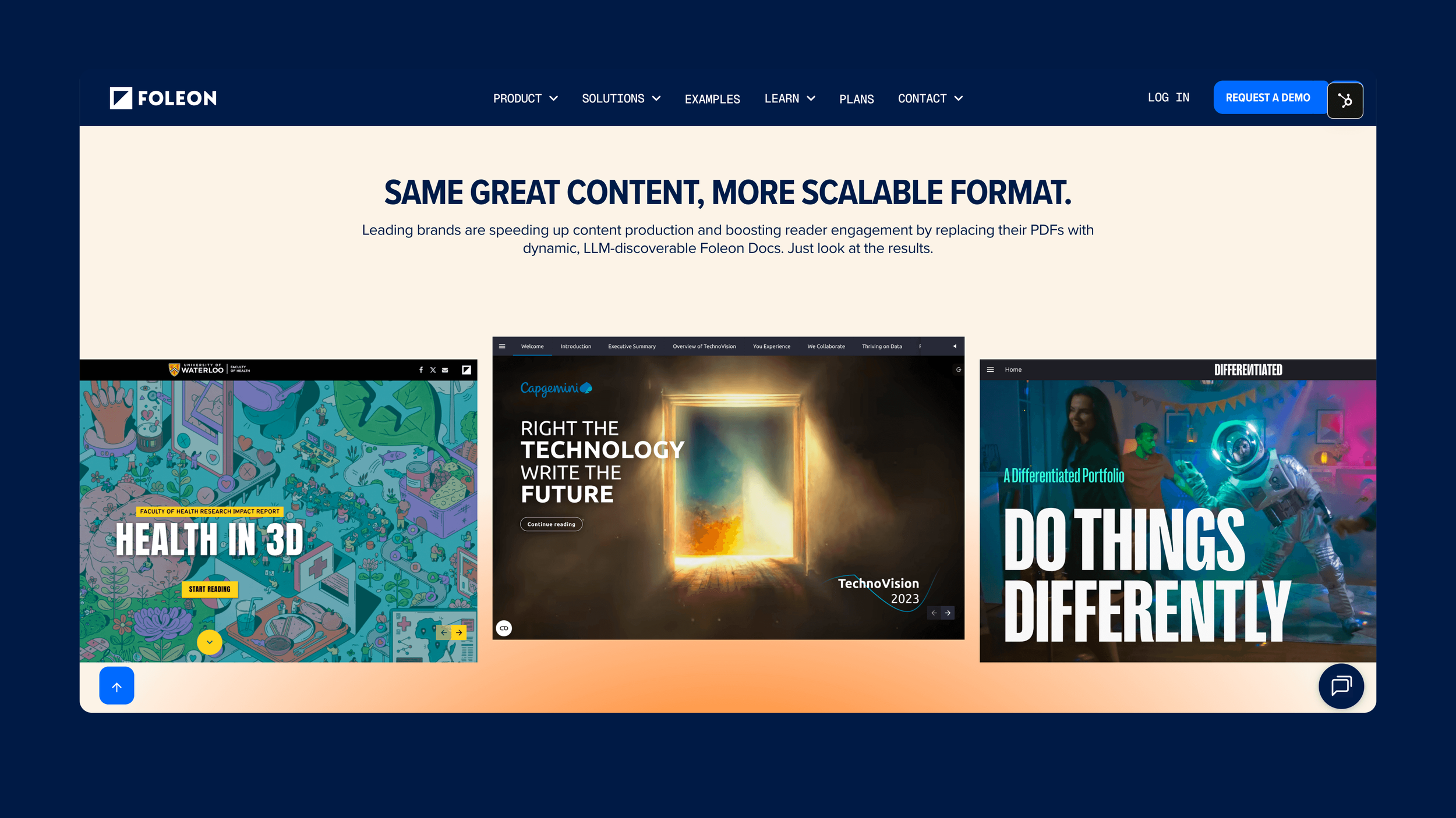
Start with the pages that do the selling.
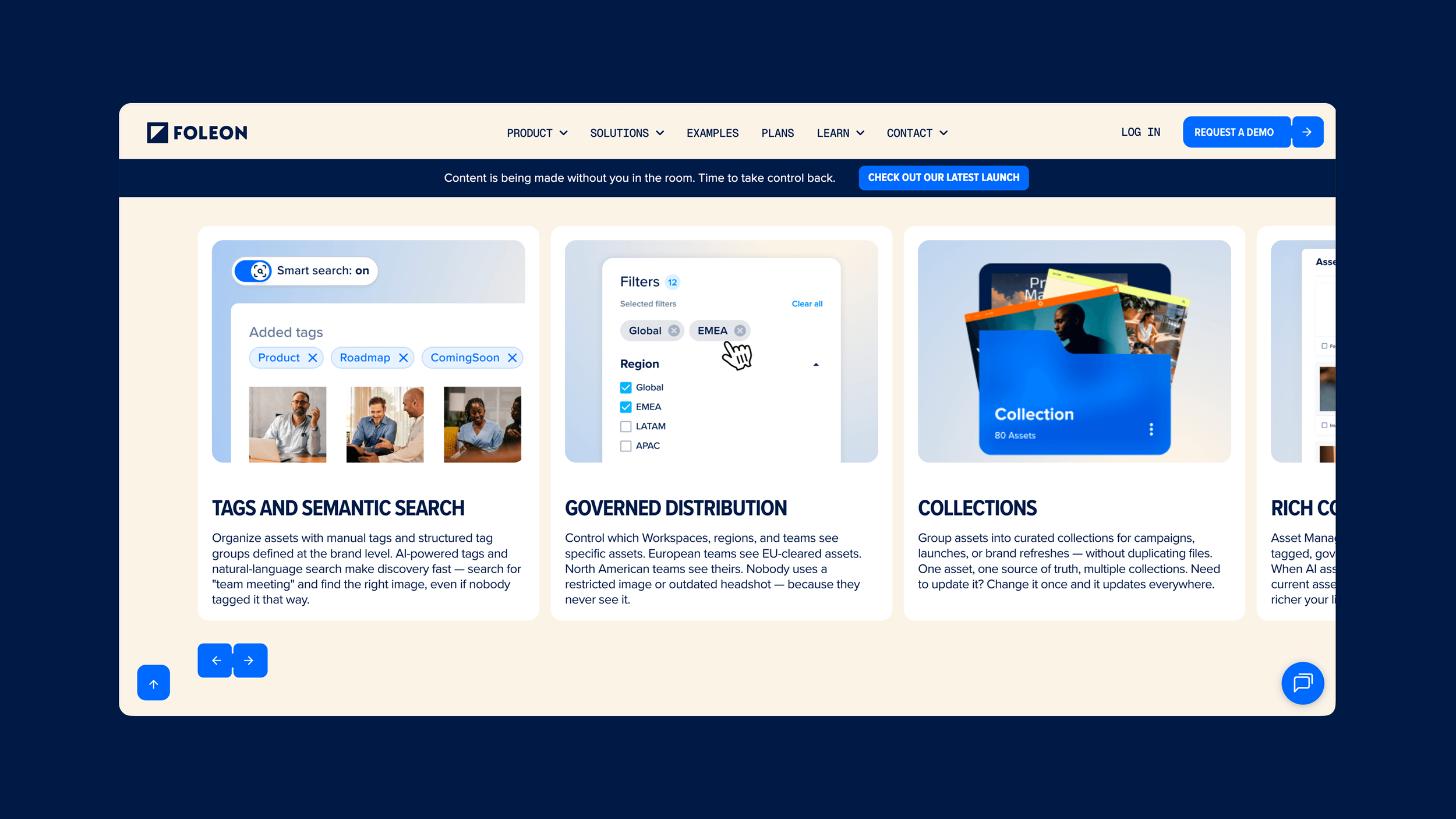
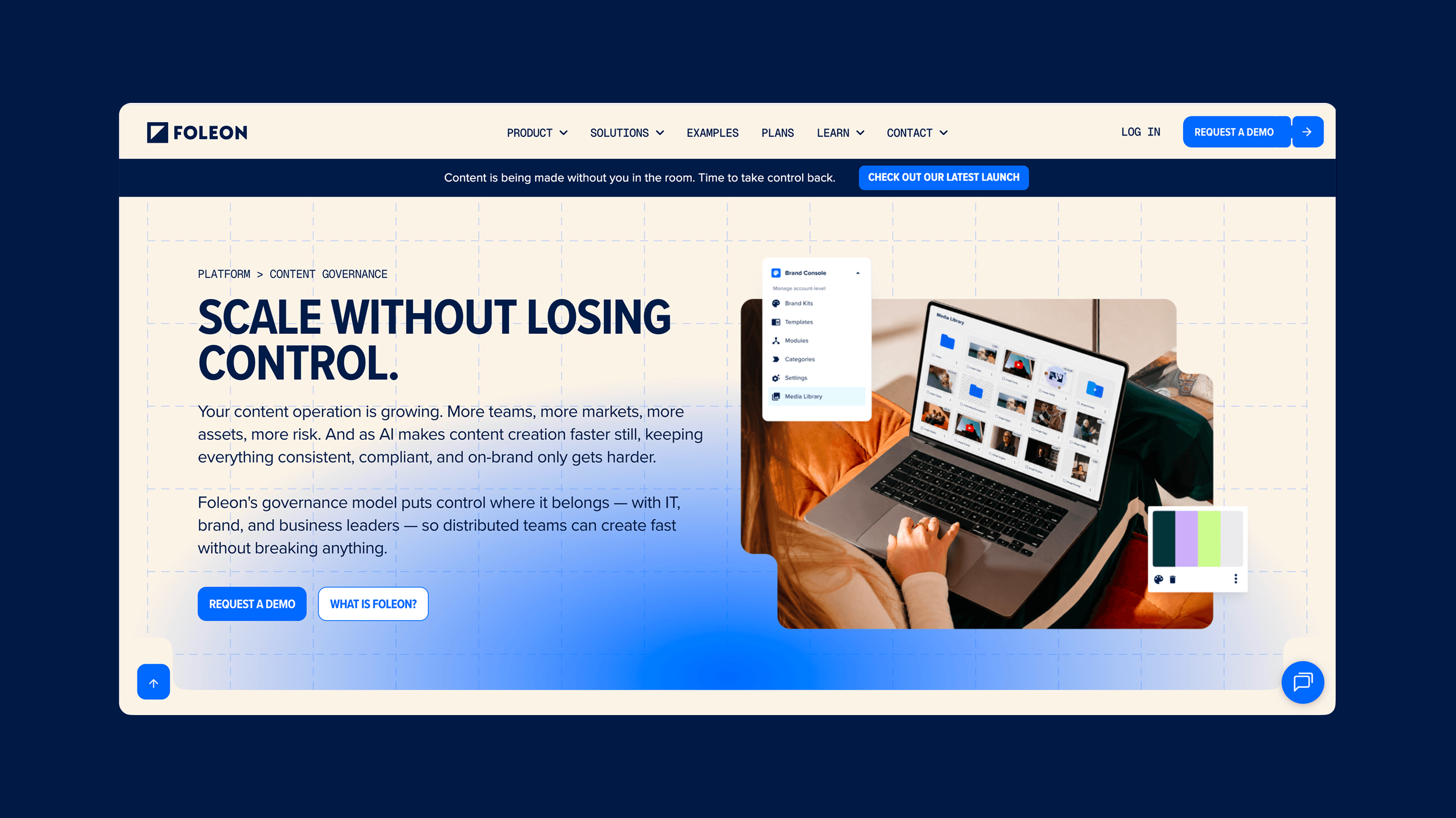
Before anyone wrote a line of code, we focused on the six highest-converting pages. Get those right, and the rest of the site has something to follow.
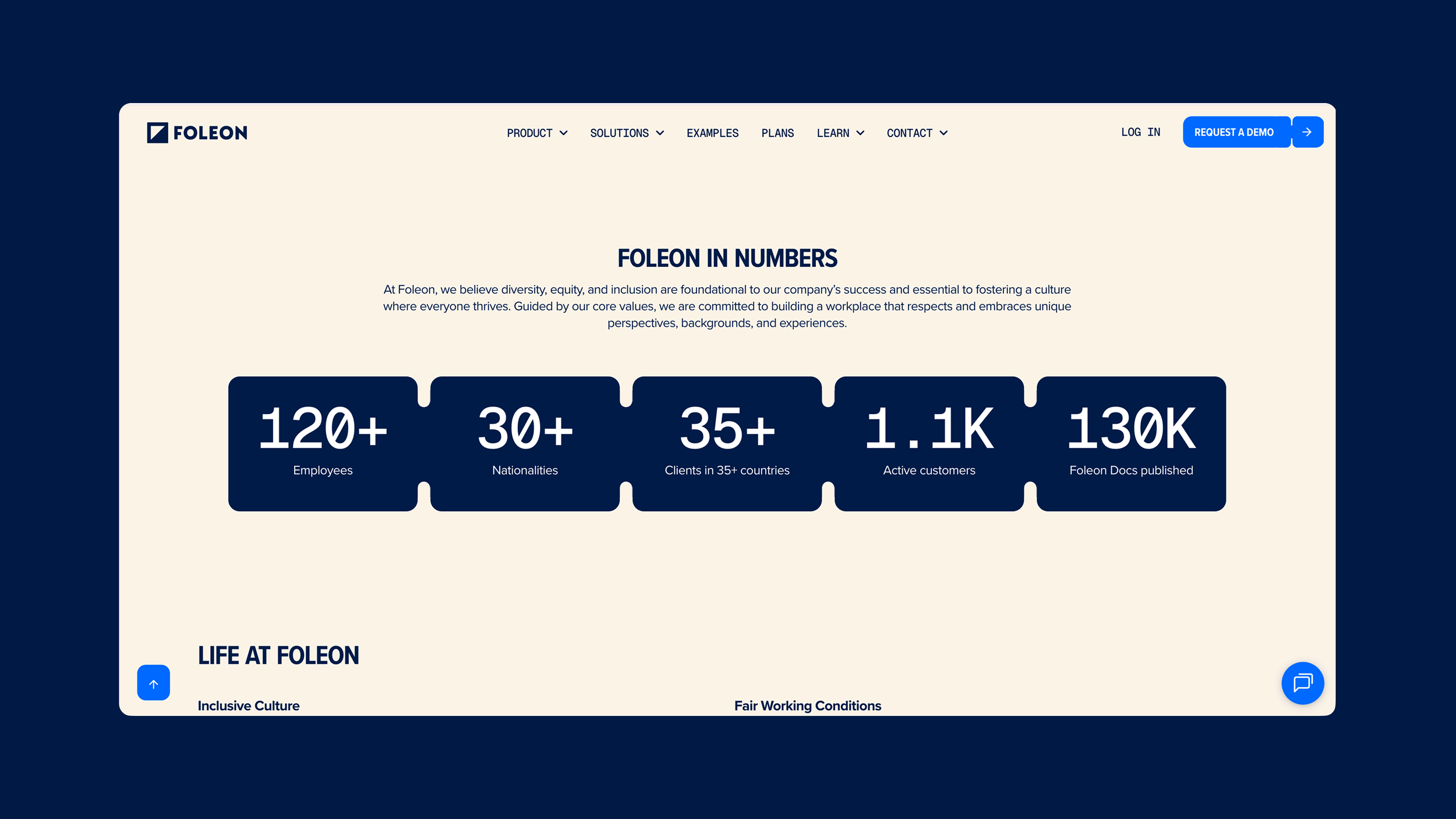
We built it in HubSpot with components and variables, so the site runs on the same logic as the brand. New page? Grab the blocks. It already looks like Foleon.
My role
I set the creative direction and owned the visual language. I made sure every page connected back to the brand system I’d built for Foleon.
I brought the brand system and the creative direction. Raadhuis owned the development and the foundation.
The design idea
Every AI company has the same website right now. Purple gradient, glowing orb, a robot hand reaching for something.
Foleon needed to look AI-ready. It didn’t need to look like everyone else.
Dark Blue does the heavy lifting. It’s deep, steady and a bit serious, the colour of a company you’d trust with your compliance team.
Cream warms it up, so it feels less like a server room and more like a well-designed office.
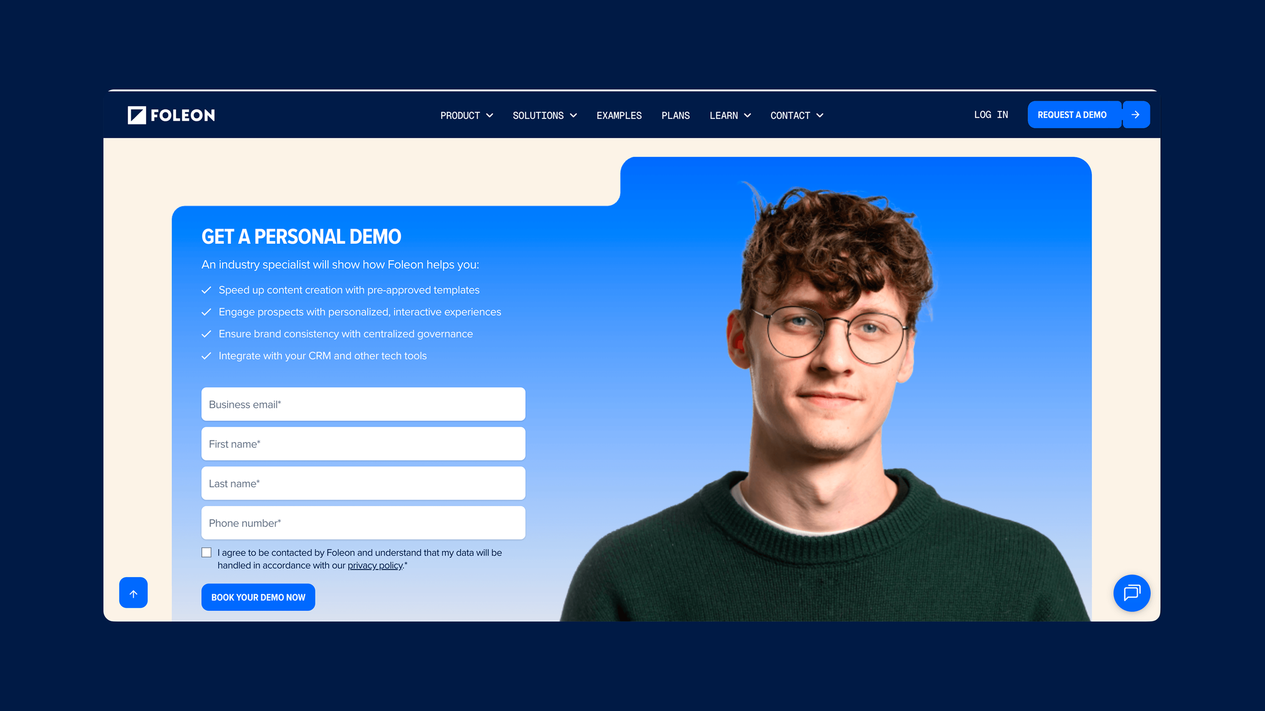
Big ones. Editorial portraits, cut out and set against the blue: relaxed, smiling, pointing straight at you.
It sounds small. It isn’t. A wall of product screenshots tells you what the platform does. A person tells you who it’s for.
And it keeps the site human, which most AI websites forget to do.
Bold all-caps headlines give the site the confidence of the “Architect” idea: Foleon is the structure, and clients build on top of it or we build the house for you!
Clear hierarchy. No fuss. Every page built from the same blocks.